What geniuses are hidden behind the most famous logos of our time? What was the context of creating the successful pieces of branding history like? Today I would like to share with you a selection with some of the most important logos and the companies that have dominated the big markets for decades. Impeccable constructions developed by great geniuses such as Milton Glaser or even Salvador Dalí.
I know there are many branding milestones to unravel and we will certainly cover them later. For now I leave you with six of them that they have no waste.
Federal express
Around 1994 Federal Express commissioned Landor Associates to redesign the company's logo. Richard Runyan was responsible for its creation around 1973 and since then it has been a myth within the world of design and an example to show the correct use of negative space. This logo has won more than 40 design awards and has been chosen as one of the eight best logos of the last four decades in the special 35th Anniversary of American Iconography issue of Rolling Stone magazine. The creation process was quite complex and more than two hundred possibilities were discarded until the most suitable one was found. The FedEx CEO immediately saw the arrow between E and X.

Shell
After making a pilgrimage to Santiago de Compostela, the Graham family decided to set the emblem of the Shell of Santiago, although it has been undergoing modifications over the years and adapting to graphic design trends. His actor? Raymond Loewy, one of the best industrialists of recent times, specifically in 1971 who took all these data into account to develop the corporate image of one of the most important commercial companies of the XNUMXst century. On the one hand it had the reference of the Concha de Santiago and on the other the strong existing connections with Spain, something that was reflected in the choice of red and yellow.

Nike
By 1971 the brand founded by Phil Knight adopted the name of Nike in honor of the Greek goddess of victory. Its logo was developed by a graphic design student named Carolyn Davidson who in search of dynamism (the only requirement that Knight asked that it be present in the brand image) developed a logo based on the wing of the Greek goddess. At first Phil was not very convinced with the result, he even said "I'm not in love with the logo, but I'll get used to it."

I love New York
The giant Milton Glaser developed the logo as a kind of hieroglyph that is made up of the letter I in capital letters, followed by a red heart below which are the letters N and Y in capital letters and with the American Typewriter font. It was in 1977 that William S. Doyle of the New York State Department of Commerce hired the advertising agency Wells Rich Greene to develop a marketing campaign for New York State. It was when Glaser appeared to work on the campaign and directly work on his image. The result was a true success that continues to sell to this day. Its simplicity and elegance means that we can immediately associate it with New York and assume it as a very easy to recognize and assimilate symbol.

Chupa Chups
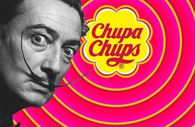
It is one of the most famous sweets in the world and its logo could not be less. In fact it is one of the relics of our field of the last century. It all started around 1959 when Enric Bernat of Catalan origin founded the confectionery company Productor Bernat and had a brilliant idea after observing how children stained their hands every time they ate candy. Our creator decided to put a stick to the candy and market it like that, in this way he would turn the candy into a more hygienic product and the possibility of enjoying it without actually swallowing it. Although at first it received the name Chups only, this changed when the radio ad that promoted it said "Chupa Chups" and since then this spot renamed it for its audience who began to call it Chupa Chups. Currently the candy is marketed all over the world but the most curious fact perhaps is that behind this brand is one of the giants of the art world, our great Salvador Dalí. Towards 1969 the company sought help in the mind of the Catalan genius and through a millionaire fee they commissioned the brand. It is impressive to know that this logo I only take an hour of work to the artist and used in it the colors of the Spanish flag. He also took the opportunity to create a round shape that was perfectly adapted to the caramel cover and thus create a powerful representation adapted to the product.

HBO
Behind the logo of one of the most important television networks of today is Gerard huertaalso, a designer who has a surprising portfolio behind him. And it is that, not all graphic designers have the possibility to apply their skills in areas as diverse as him. Among his great creations are logos of companies such as Eternity by Calvin Klein, MSG Network, CBS Records Masterworks logo, The Atlantic Monthly or PC Magazine. We cannot forget that he himself developed one of the most legendary logos in the music scene: ACDC.
