
We all know what Photoshop is, but currently not everyone knows this tool fully. Currently, Photoshop has multiple tools, one of them is the possibility of creating textures.
With just a few simple steps it is possible to create a wood texture that can be used previously for a project. Here are the steps to follow to create this new Photoshop design.
What is Photoshop
Before entering the tutorial, if you are completely unaware of this tool or if, on the contrary, you have heard about it but it is not clear what it is exactly, we are going to explain it to you. Photoshop is one of the tools that are part of Adobe, it is dedicated exclusively to the editing and revealing of images. Many designers also use it to create photomontages.
It works with a bitmap and with any image format, which leads us to the possibility of being able to manipulate, modify, edit and retouch everything we want, through all the tools that the program has. In addition, it is also possible to create banners, billboards through mockups that can be quite realistic and simulate certain fictitious environments.
If you know Illustrator, you will know that it has a wide range of brushes and inks, in Photoshop we find multiple brushes as well and we can also find all the fonts that Adobe provides. Being an Adobe tool, it has a monthly subscription, that is, it is a paid software.
In short, if you are looking to design and create montages, Photoshop is the ideal tool for you since it is capable of doing magic just by choosing a tool.
And now the time has come to get fully into the program and explain step by step how to create a wood texture.
What you need to know before starting
As indicated at the beginning of the post, we are going to create a wood texture. It is good that we know in advance, a little about the texture of wood since we are going to work with tones suitable for it. In this short introduction, we show you the tones that you should take into account for the texture that we are going to create and the thousands of other options that you can design.
Wood textures are characterized by being quite customizable and creative, they also have different styles and depending on the type of wood we choose, it contains a darker or lighter tone. These colors are also determined by the degree of hardness they contain and by their touch.
Timber mild it is lighter and cream-colored, the fibers are straighter and contain distinct rings. This wood is usually seen in pine trees. Timber hardOn the other hand, it tends to have darker tones, the fibers are more compact and closed, and their rings do not vary. This type of wood is found in the cherry tree.
Step 1: Setting up the artboard
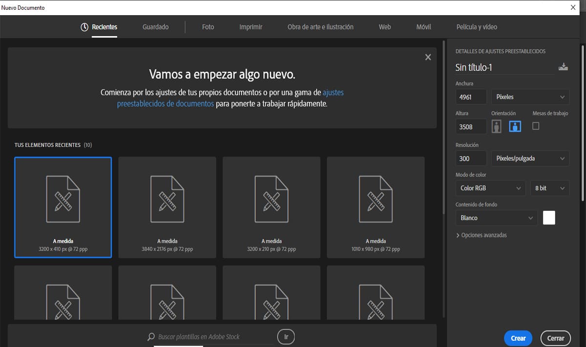
For this tutorial, we are going to work with an artboard whose length will be A3
To do this, open Photoshoppress Command-N to create New document and set the following parameters:
- Name the file 'Wood Texture_01'
- Width: 4961px
- Height: 3508 px
- Orientation: Horizontal
- Resolution: 300 dpi
- Color mode: RGB color (for later printing use CMYK color profile)
- Background content: white
- Create
Step 2: Create the base of the wood texture
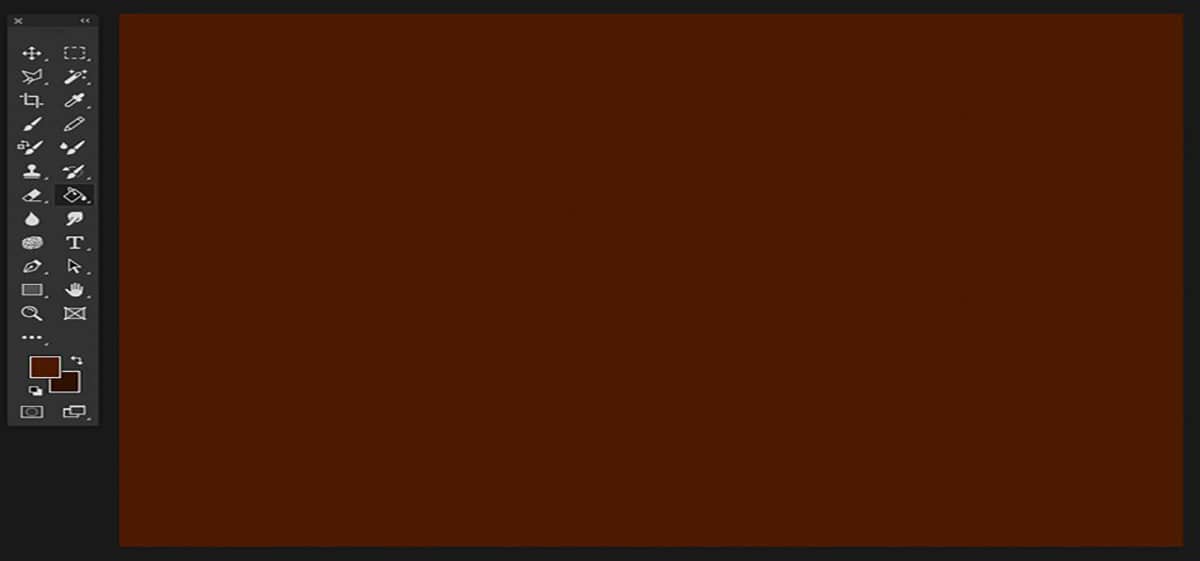
Source: Diseñalog
Step 1:
To create the base, we are going to start with a mahogany wood. The mahogany color differs by being a color similar to the medium and deep brown color. In general, we have to get a reddish color.
To set the color in our rectangular base, we go to the bar tools and we establish the following chromatic value of front: # 4c1a01 and a color of fondo: # 2f1000.
Once we have configured the following colors, we go to the tool of paint pot (G) and fill in the space on the artboard.
Step 2:
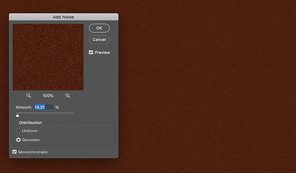
Source: Diseñalog
To make the texture much more realistic, we are going to apply a layer of grain, for this it is necessary to apply different filters.
We go to the top of the screen and select the menu Filters> Noise> Add noise and apply the following parameters:
- Quantity: 14.21%
- Distribution: gaussian
- Trademarks Monochrome
Step 3:
Finally, we return to the menu Filter and we select the option Clouds> Filter> Render> Clouds.
Step 3: create the wood grain texture
Once we have created the base, we are going to create the texture and apply it on top of the base, which is what interests us the most.
Source: Diseñalog
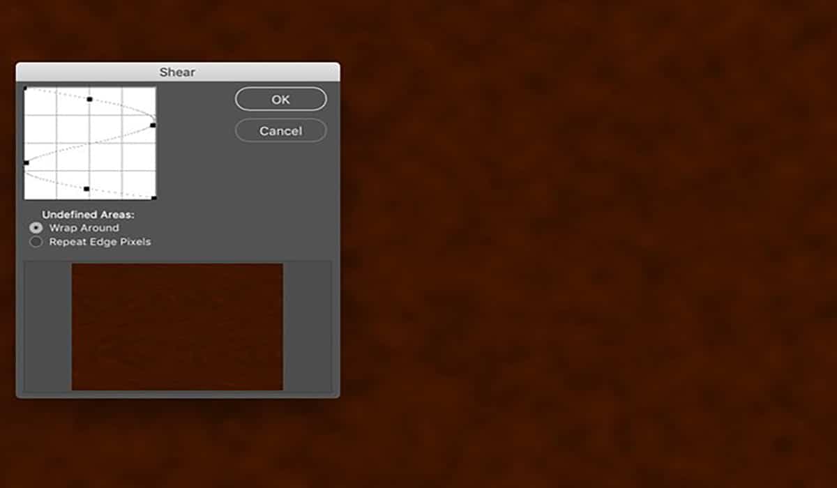
Step 1:
The base will be given a wood grain effect. This is necessary since mahogany wood has a small fringed grain, is closed, and is small and straight.
To do this, we will need to go back to the top menu and select the option filter> distort> project. Then the following pop-up box will open To project.
To set the next projection curve, we click on the curved line and drag the edges to form a kind of flipped or rotated "S".
Step 2:
Once we have adjusted the grain amount, we are going to adjust the levels, for this, we have to apply a contrast to the grain layer.
To adjust these levels, it is necessary that we go to the top menu and select Image> Adjustments> Levels (Command - L) and adjust the channel RGB to:
- R: 14
- G: 0.91
- B: 255
Step 3:
As we have specified previously, the mahogany color has a striped grain, to achieve this effect, we need to apply a wave to the texture, with this we will achieve a much more natural effect of the material.
To get this wave, we will head to Filters> Distort> Wave and we will establish the following parameters:
- Number of generators: 606
- Type: sinusoidal
- Wavelength: Min 90 Max 152
- Amplitude: Min1 Max 52
- Scale: Horizontal 19% Vertical 1%
- Undefined areas: turn around
The result would be such that:
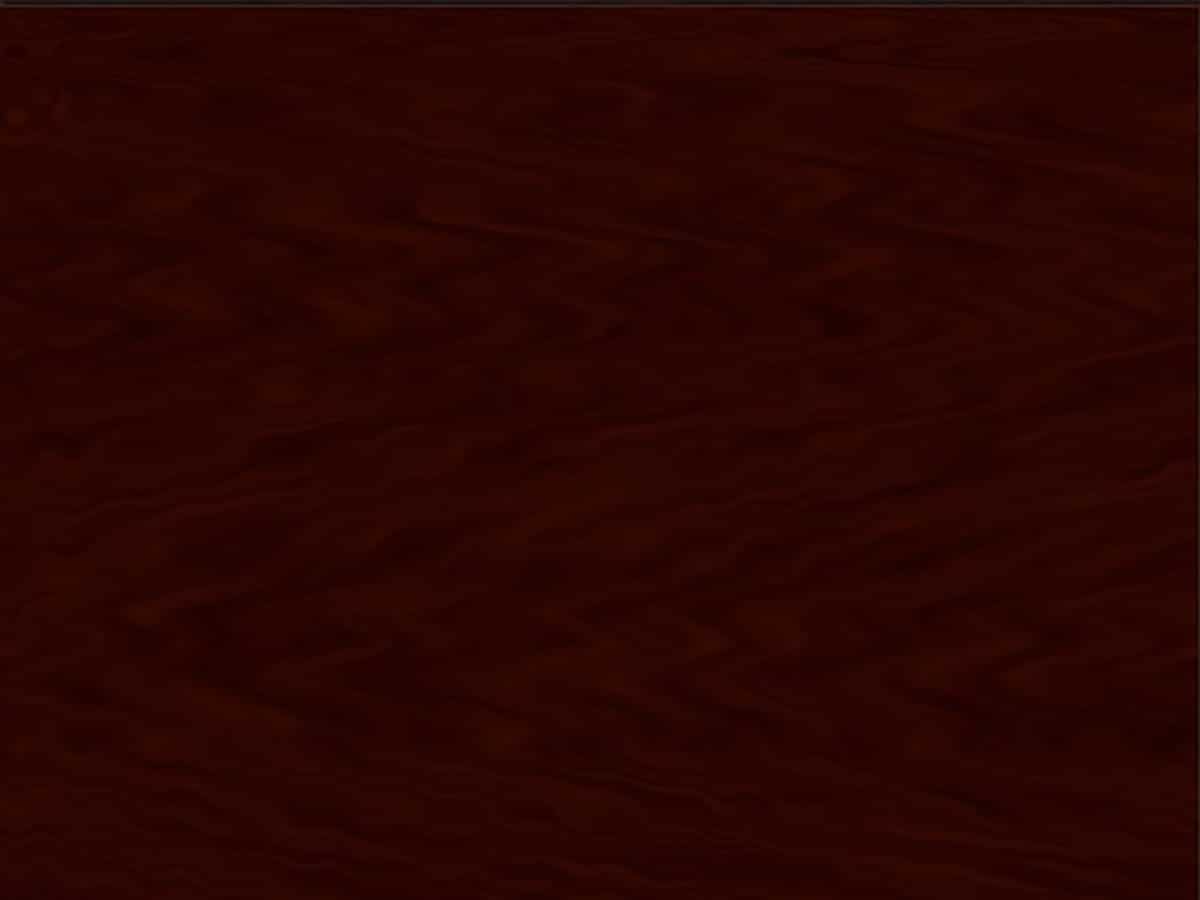
Source: Diseñablog
Step 4:
Once we have achieved the first effect, we continue adding a manual distortion for this we will apply the tool Liquify (Filter> Liquify)
With the Pinwheel tool (C), we will add some knots to the wood and with the tool brush we will get more successful results. Once we have finished adjusting it with the brush, we go to the tool warp forward (W) and we will apply some stains in order to find a more natural result.
Step 5:
Once we have the settings applied so far, we will have to change the color of the wood to a lighter tone, we do this in order that we can better appreciate the fibers.
To do this, we will go to the upper menu and select the option of Image> Adjustments> Levels (Command - L) and we move the sliders until we obtain the perfect or desired color.
To achieve this result, you must set the color profile to RGB and select the following values:
- R: 0
- G: 1.061
- B: 232
Step 4: sculpt the wood grain
Step 1:
Once we have changed the tone to the wood, it is time to polish the result so that it is as real as possible. For this we are going to sculpt the wood grain, focusing each of the fibers so that it is more defined.
We go to the menu and select Filter> Sharpen> Sharpen.
Step 2:
To sculpt the grain we have to first open the panel of layers (Window> Layers). Once we have it open, we must duplicate the texture layer, first drag the layer of the fondo towards the little icon create new layer in the layers panel.
We return to the top menu and apply the relief Filter> Stylize> Emboss. Once we open it, the highlight box will appear and we will adjust the parameters in this way:
- Angle: 135 °
- Height: 24 pixels
Step 3:
We are almost done, we just need to polish the small details. We go back to the panel layers and we set the layer to blending mode, then we apply intense light and a 40% opacity.
Step 5: Save and apply texture to an object or design
When we have our texture designed, we have to save it to be able to apply it in any mockup. A good result could be the wall of a wooden house or the floor. Next we will explain how to do it:
Step 1:
To save the file we go to the upper menu and choose the option of File> Save As. Leave the name as we configured it when creating the artboard and select a standard format JPEG and save it in your work folder (it can be on your computer desktop or anywhere else).
Applies a quality of 10 maximum
Step 2:
I leave the second step to your liking, but first of all, I would like to offer you a web page where you will find thousands of templates to download, you just have to click here and will direct you directly.
On this page you can find thousands of mockups of all kinds to download and apply your texture, from books, restaurant menus, tables, etc.
What is a mockup?
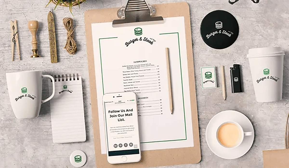
Source: The Creative Creature
Previously we have named you the word "mockup", if you don't know what it is, we will give you a brief summary. Graphic design or design in general will surely come to mind. Well, you're doing very well, in fact a mockup is a fictitious and at the same time realistic presentation of a design project.
What does fictitious and realistic mean? Well, it is said that it is fictitious since a mockup cannot be seen in reality but it simulates what we want the people around us to see. Let's say that in a project, we need to show others that our work, in addition to being aesthetic, is functional.
And here the objects that we have named you before come into play, restaurant menus, t-shirts etc. That is, to create mockups we always start from the base of merchandising objects and with it, we pretend or simulate a real assembly. Mockups are usually designed for various reasons, one of them is because it is about seeking the approval of others, in a design project it would be the client. This is often seen a lot in identity designs, since in a visual identity it is about presenting the brand in any promotional object (business cards, notebooks, diaries, calendars, etc.).
What must be taken into account in a mockup?
First of all, without a doubt, choose a mockup that is professional, that has a lot of light. When we design, it is always important to anticipate and maintain our color palette, since it is important to know in advance if those tones can positively benefit the proposal that we are going to present.
It is also always important to choose images that have a good resolution and that have a good quality, since what is most disadvantageous in a mockup is seeing a pixelated object and above all choosing objects that are consistent with your project.
Where to find mockups?
Currently on the internet, we can find many online pages that are dedicated to the sale of mockups or even find them for free. If you have any preference for looking for them for free, my advice is to look it up on Freepik, Graphic burger and in FreeDesignResources.
Here we also leave you some other websites from where you can download some mockups:
- Unblast
- pixelbuddha
- The Designers
- Creative Market
- Envato Elements
- Graphic Burger *
- Free Design Resources
Conclusion
As you have seen, creating a texture in Photoshop is not difficult, just follow the steps we give you and you will become one of the best designers.
What will be the next texture that you design?