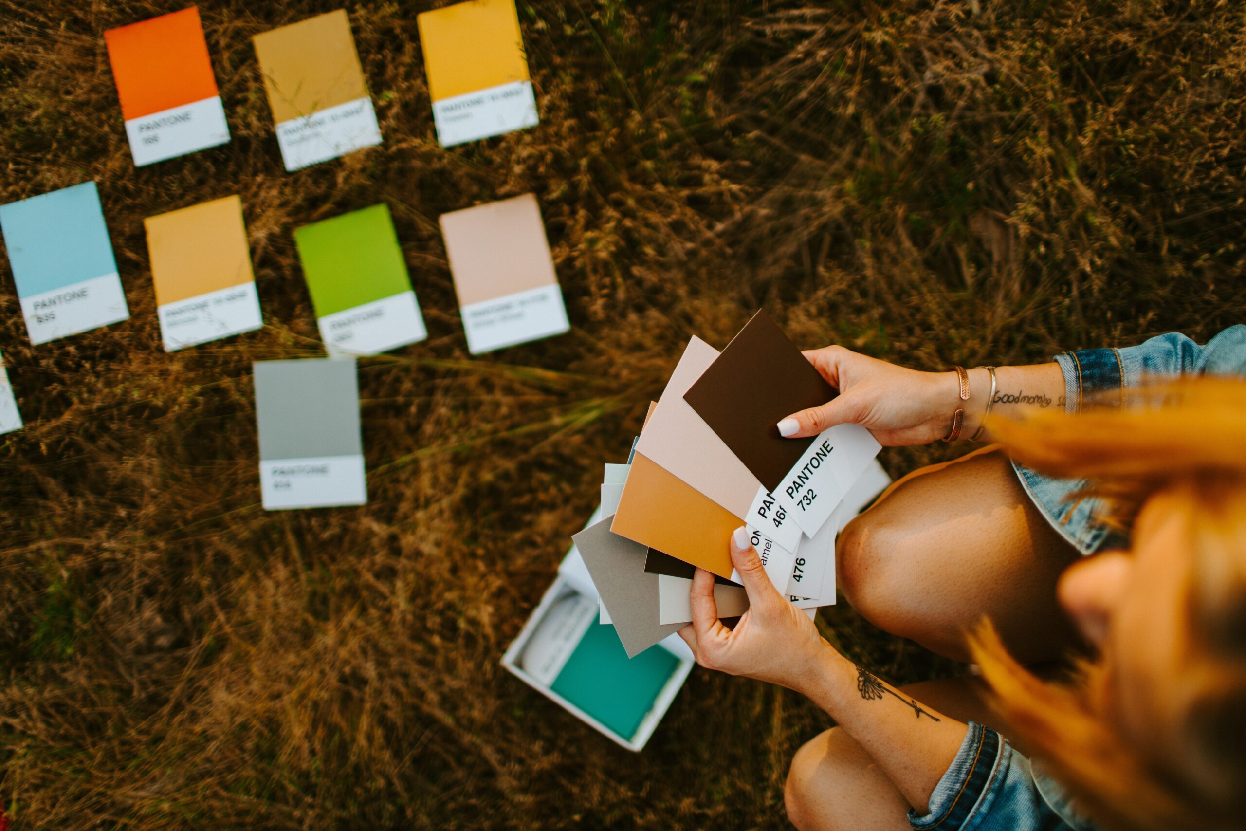
In graphic design, very few decisions respond solely to aesthetics, neither do color decisions. Color is a communication tool and how you combine them can completely change a design and the sensations it awakens. Knowing the theory of color and the principles that govern it can help you create more efficient pieces and to control what your creations transmit. Think that when looking at a poster, a poster or an infographic, the first information we process is related to color. In the case of web pages, for example, an inappropriate color palette can even lead us to abandon the site, just as a perfectly harmonized one can predispose us to positively assess the content.Do you understand now why it is so important to know the theory of the Colour? Well Keep reading this basic guide to combining colors and learn all the tricks.
What is color theory?
color theory is a set of basic rules that define all the fundamental aspects of color in graphic design, art, photography or printing. It helps us understand the effect that certain colors have and we provides invaluable information on how they are created and how they complement each other.
Fundamental concepts related to color
Before delving into the subject, I think it is important to know the meaning of three fundamental qualities that help us define the properties of a color: hue, saturation and lightness.
Tonality

Synonym of tone or hue, refers to the degree to which a color can be described as similar to or different from other colors (usually primary colors: red, yellow, blue). Simplifying, it is what we call "color".
It allows us to catalog with a name to specific colors based on the predominant frequency. For example, if we look at the image above, almost all of us define those tones as close to red, because that is the frequency that we capture.
Saturation

Is degree of purity of a color, the purer a color, the higher its saturation. Sometimes, we mean saturation with the term "intensity", since the most saturated colors, the purest, are also more intense.
Luminosity

Also called clarity, is the property that makes us perceive colors as light or dark, since the darker colors are those who have a weaker luminosity and in the clearest the exact opposite occurs. Sometimes we associate this concept with terms like brightness, value, or luminance.
Color wheel or chromatic circle

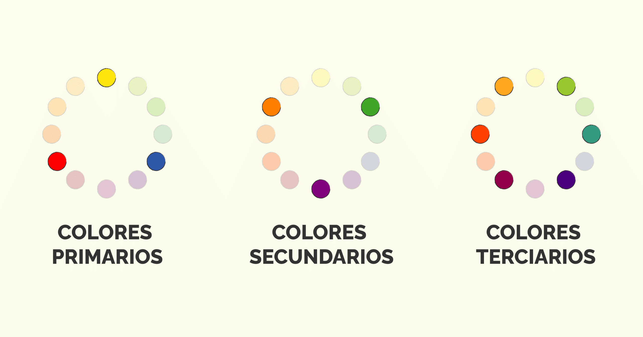
The chromatic circle, also called color wheel, is a very useful tool to create suitable palettes and combinations. Order sequentially the progression of colors, each occupies a fixed position, and helps us understand the relationship between them. Based on these relationships, we can differentiate three kinds of colors: primary, secondary and tertiary.
Color types
Colores primarios
They are the reye, yellow and blue. These are not created when combining two or more different colors, therefore, are the base of the rest of colors. By combining them, we generate the secondary colors.
Secondary colours
They are green, orange, and purple. Secondary colors are created by combine two primary colors.
- El purple is the combination of red and blue
- El orange is generated by mixing red with yellow.
- El Verde born from the union of yellow and blue.
Tertiary colors
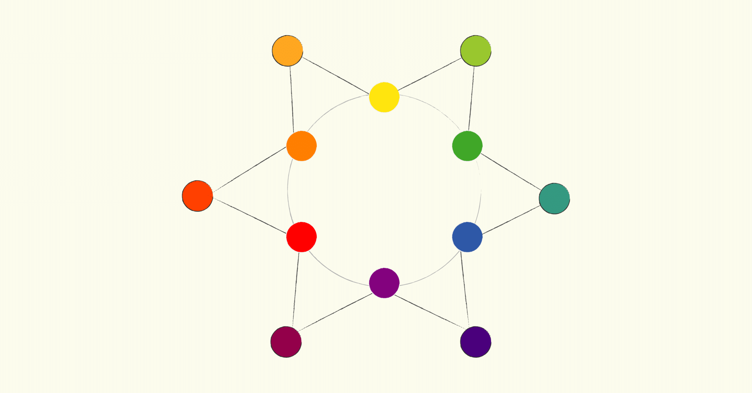
Tertiary colors are those created by mix a primary color with a secondary color:
-
El oranged Red or vermilion arises when combining red and orange.
-
El yellow orange o amber is born from the combination of orange and yellow.
-
El greenish yellow, lime or Carthusian, is obtained by mixing green and yellow.
-
El greenish blue, turquoise blue or teal, is created by combining the color green with blue.
-
El blue violet it is born by mixing blue with violet.
-
El purple red or garnet we obtain it by combining red with purple.
It is important that you know that primary colors cannot always be harmoniously combined with a secondary color to generate a tertiary one. For example, if we combine blue with orange, only we will get a brown tone. It is also interesting and necessary to create these tones, you just have to be clear that They are not classified as tertiary, secondary, or primary colors Curious fact! If you mix the three primary colors, you also get brown.
What about black and white?
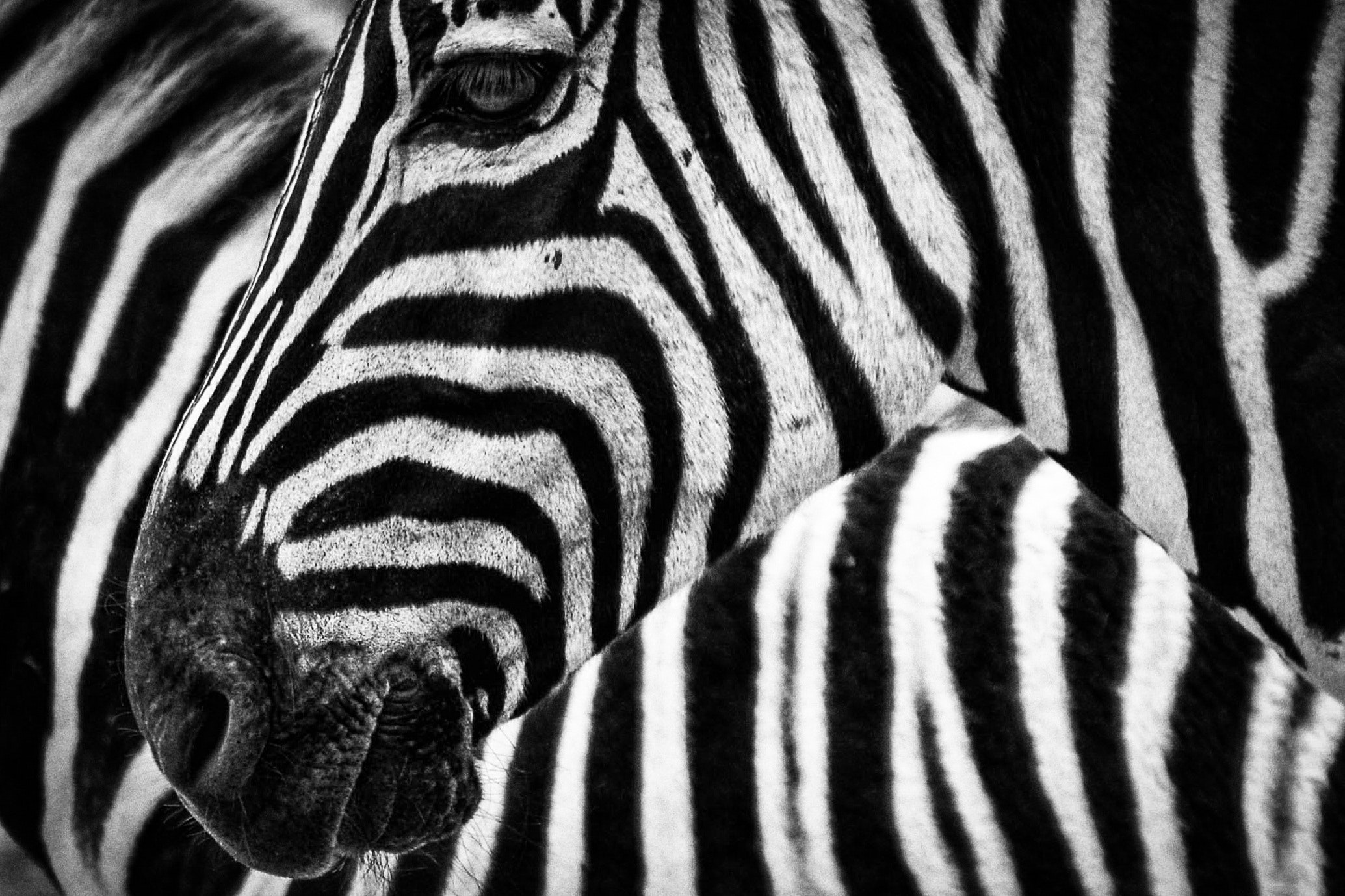
What I am going to tell you now is going to leave you completely perplexed. Scientifically, black and white are not colors. Black is the absence of light and white is the combination of all shades of the visible light spectrum. However, we see black and white constantly stamped in designs how is it achieved?
Actually, everything we see is not purely black, nor purely white. They are very very approximate tones that are obtained by combining pigments of various light or dark colors.
Color matching guide
Color harmony
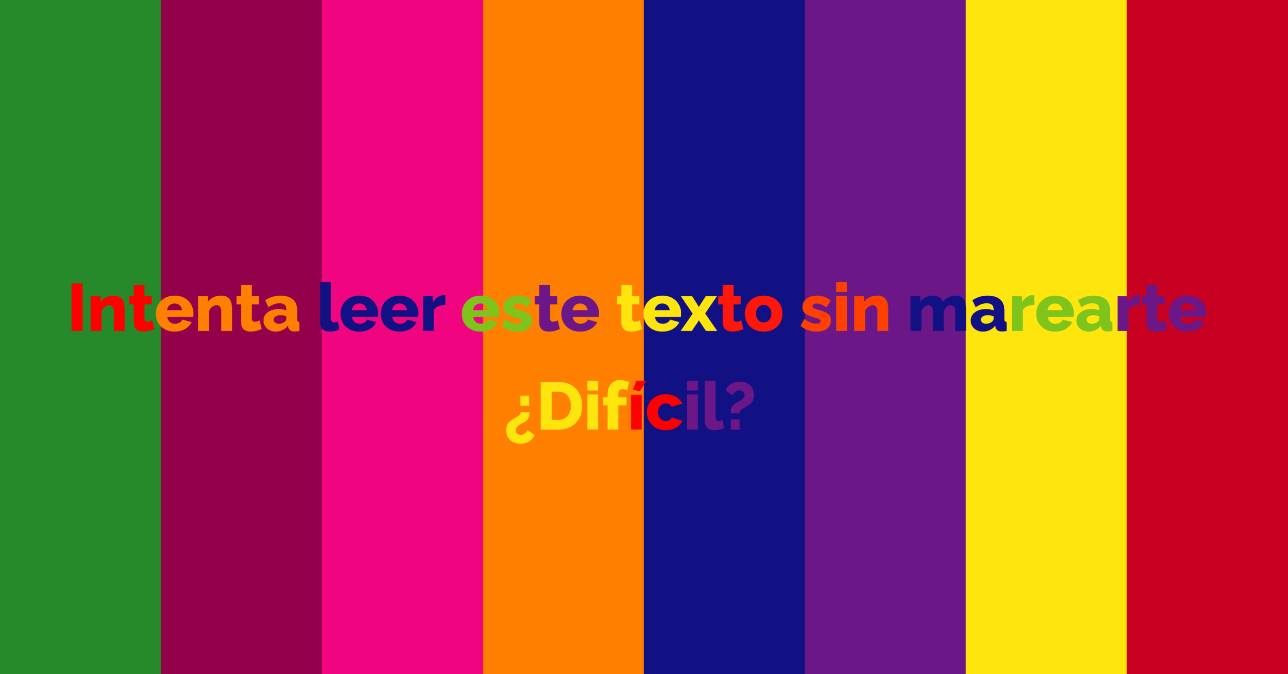
Color harmony is simply what makes us perceive a color combination as something neat and pleasant. When a palette meets that harmony, we feel a kind of "Visual calm" which makes us interested in a designSimilarly, when we see color combinations that don't work, we tend to reject it. Very common mistakes are forget that there must always be a dominant color and that we should not use too many meaningless colorsDoing so could even make the message we want to convey unintelligible (as in the image above).
How to combine colors with the chromatic wheel
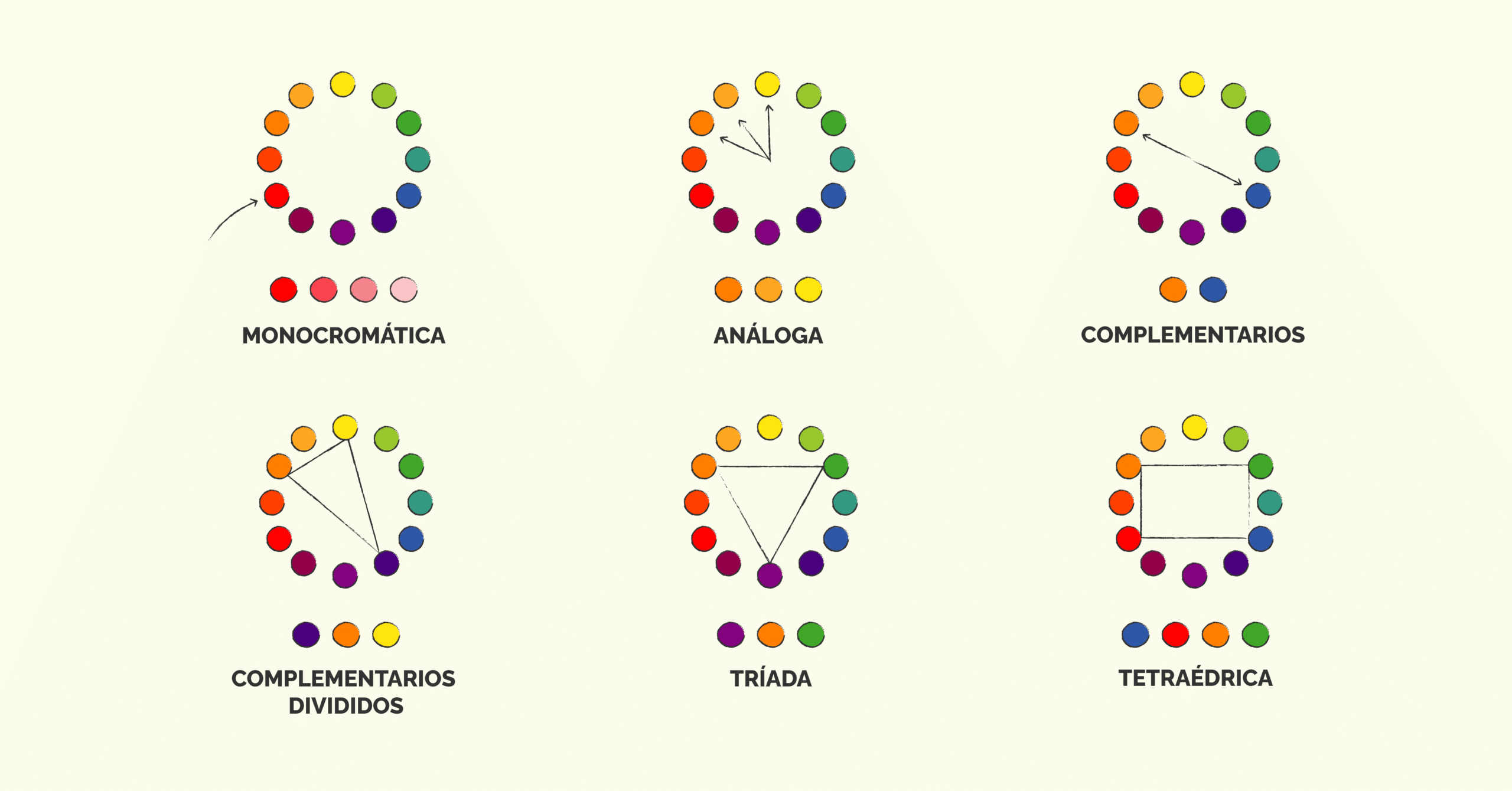
The color wheel can help us create harmonic palettes. There are formulas that allow us to obtain basic palettes. Then pWe can customize and work them as much as we want to get new combinations. exist 6 ways to combine colors with the chromatic circle.
- Monochrome combination: In these combinations we use a single color from the chromatic circle and the rest of the tones are obtained by playing with saturation and luminosity.
- Analog Combination: It is formed by combining the colors that appear together on the color wheel.
- Complementary combination: It is obtained by combining chromatic opposites, such as blue and orange. With this type of combination you have to be careful, there is a great contrast between the colors that compose it and that can generate some “visual stress”. The best way to combine them is looking for balance, opting for less saturated tones or using them together with a dominant neutral tones or white.
- Split complementary combination: It is the same as the complementary one, only a color close to the complementary one is included. Although there is still a lot of contrast, by playing with the proportion in which each color is used, much more harmonious designs are achieved.
- Triad: For this combination, an equilateral triangle is drawn on the color wheel and the colors left in the corners are used.
- Double complementary or tetrahedral combination: two pairs of complementary colors are combined, it is the most difficult to balance, normally a dominant color is chosen and the saturation or luminosity of the rest is lowered.
If you liked this guide to combine colors, you cannot miss our post about pastel color palettes.