
Design trends tend to change every year and some brands see it as an opportunity when any of these changes suits their logo with which they identify with the customer.
Now, we present 10 popular brands that in 2014 they changed the logo for one more updated to the times. Among them we can highlight PayPal, Deviant Art, Pizza Hut or 7up, brands recognized by all and that point to new lines and angles in their popular logos.
Deviant Art
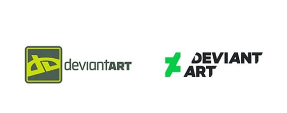
Deviant Art already needed a radical change in its logo and its website that finally even came with an app for mobile devices. A more current design for the new logo that represents this popular site for illustration and art.
Pizza Hut
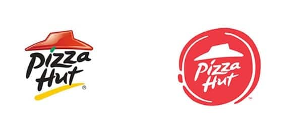
Pizza Hut introduced a new ad campaign called "Flavor of Now" and for the occasion has launched a new logo which stands out for the only red color as its own entity for a quite radical change although it follows the essence of its famous pizzas.
Southwest
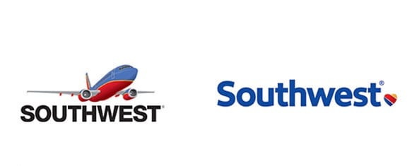
A brand that it is not so well known in these parts but that he used 2014 to change towards a more discreet and a little flirty logo with that heart at the end of the logo. Interesting change eliminating the plane that had in the old logo.
7up
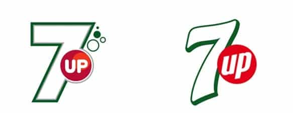
With 7up we go from the straight lines of its lines to more accentuated edges by having time-changing curves for this popular refreshing drink.
Black & Decker
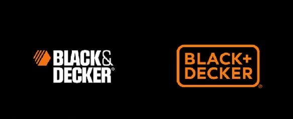
Black + Decker goes to the orange color that was used in a part of its previous logo and now the name of this popular brand is grouped in a rectangle of tools.
airbnb
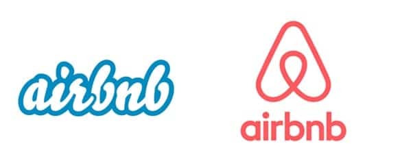
This trade mark yes it makes a radical change in its logo going from blue for a text to the appearance of a logo represented just above the brand name with an accent on the straight.
PayPal
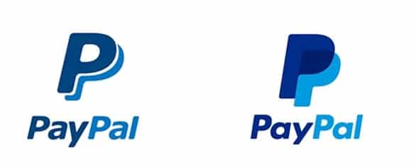
The overlap is the most remarkable element in updating the logo of this popular online banking services brand.
Bacardi
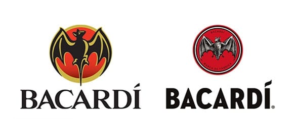
El popular bat becomes somewhat more realistic with the use only of white, black and red for the representation of the new logo of the brand of this popular alcoholic beverage.
Monster
![]()
There are no words to express the new logo by Monster. A picture is worth a thousand words.
Olive Garden
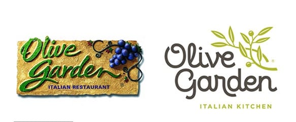
To finish the most radical change from what is a representation of a bunch of grapes for a passing restaurant l use a curious shade of green and the use of a rather flirty font.