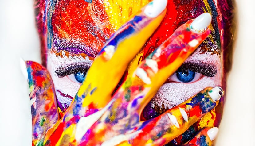
More or less all we know the emotion or sense that a color gives. One of the clearest examples is the red of the planet Mars that indicates combat or that of the cherries, which we translate the second to passion. Knowing the meaning of each color is useful to accentuate a feature in a message of a meme, or even to be the focus of the color palette of a web design.
But what happens when we want to combine them? We could say that the problems appear to try to find that that green can better fit with a lemon yellow that softens the intensity of one or the other. It is one of the keys in the design to know how to choose the correct color so that visual harmony appears in the viewer or user who is opening our application for the first time.
With this we go directly to what it takes a well-trained eye to quickly identify which color matches another to give a specific meaning. Whether we want to dazzle the viewer with a spectacular panorama, a romantic sunset or a dynamic scene in which the different colors are capable of giving us the feeling that the image is moving even when it is static.
Colors
Before moving on to more complex color combinations, let's go color after color to talk about its main peculiarity and those colors with which it gets along. We will always recommend that experimenting is another way to find these combinations, although as we have said, we must have a hard eye or have that innate talent to identify combinations that arise naturally.
The color orange
We are facing that color that is capable of provoke great aggressiveness when we find it as the lynchpin of Stanley Kubrik's A Clockwork Orange design. Even so, it implies the meaning of change, the modern and what stands out. We are facing one of those colors that you like or do not like, but that are original.

Takes well with own orange palette and with a color like green. It is also with the lands that we can find him, apart from some red ones. If we don't want to get too complicated, putting it next to a range of shades of orange will be its best position.
The color Purple
We have already known that this coming year, 2018, UV is the color chosen by PANTONE. A color that is attributed to mystery, to the unknown and the exploration of all that is to be found out. Provocative and thoughtful, we are facing another of those colors that have been worn by artists like Prince.
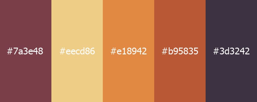
If we look for combinations, we can find him very well with the lands, range of oranges and a series of purple tones that are always less intense than the primary. Green can be a good contrast, especially when it is more blue than yellow.
Yellow color
One of the most striking colors at first glance, although always it will depend if it has more red than blue. Tending to orange always makes the eyes rest, but with blue, the cold begins to give other types of feelings that are more related to anger. It is a difficult color in itself.
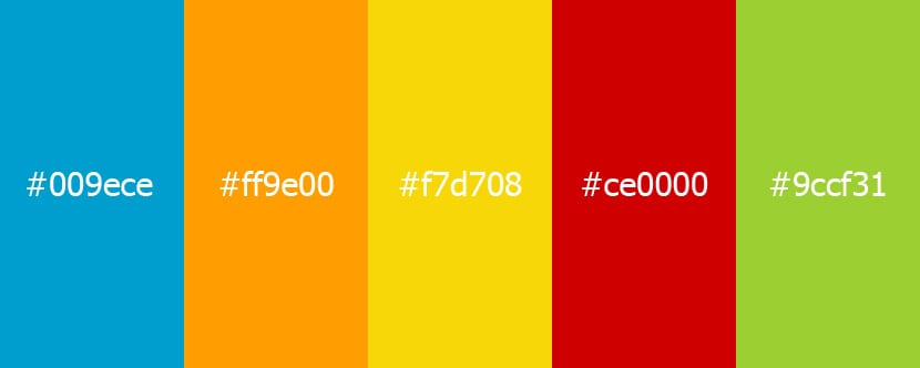
With a sky blue we can put it to make a good contrast and when it approaches any of the blue or red tones, it is able to get along with anyone. We can also surround it with dark tones so that it stands out enormously in any scene.
The Red
El color of passion, of love and the one that is capable of making us feel more things. It is one of the primary colors, so its stability depends a lot depending on how we face one or the other. We can accentuate its meaning with gray, while if we look for green we can reduce that passion and energy that it is capable of providing in any web element in which we use it.
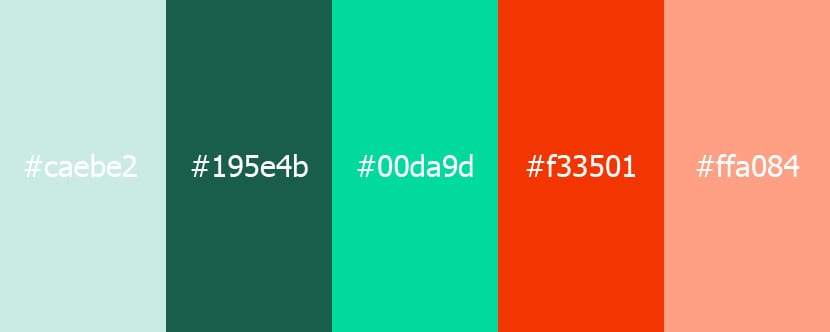
With green it combines quite well, but it will depend on the tone of it. A olive will always be a good playmate. We can take you through a range of reds with white to finish in pinks.
The color blue
The king of cold colors and that is found everywhere to give, initially, stability, tranquility and coldness. You only have to look down the road to find this color in a large number of cars.
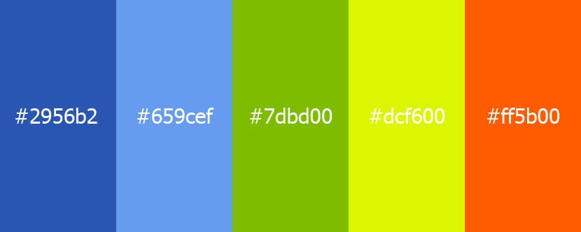
We can combine you with a range of blue tones, as with green and red. If we do not want to risk a specific design, we can be sure that we will not go wrong if we do not mess it up a lot.
The black color
Darkness, death and pessimism emerge with the color black, although it can also be given another meaning with luxury and elegance. You just have to see that it is the color of the tails and evening dresses for the finery.
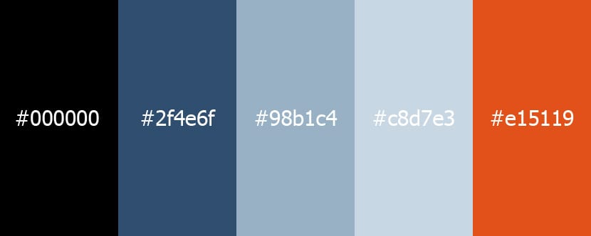
It is a color that blends perfectly with all, although it is only capable of offering that sense of luxury and elegance.
The color green
All the renewable energy, nature and the planet they really dress to show the living and the healthy. It is also attributed to poison and if you look at cleaning products, most of them use green to offer those senses.

We can combine with earth colors as with a range of greens that take us to that nature and attribute it to a good state of health. With brown it also gets along very well.
Complex color combinations
A few combinations that serve us to give different senses and projections visuals for web design, applications or a job in which we need to find three or four colors that are worth to appease the viewer's gaze.
Classic and retro
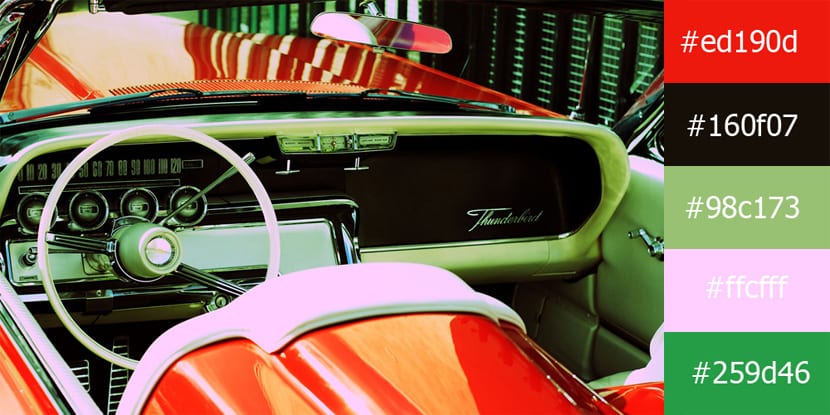
If we go through black, a cool olive green, a carmine red and a brown, we will find a color palette that works perfectly for a photograph of a retro car.
Gleaming blues and greens
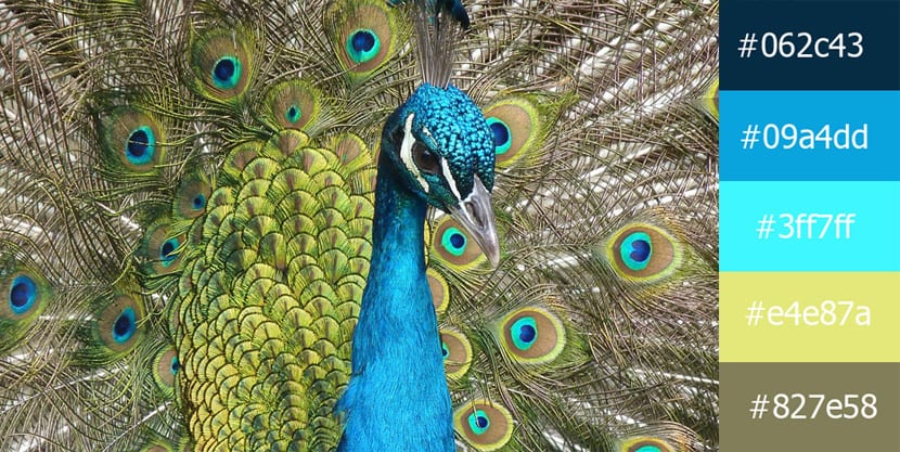
Different shades of light and dark blues plus a yellow, they are capable of giving a lot of dynamism to any scene or what would be an animal showing its vibrant feathers.
The purples and oranges of sunset
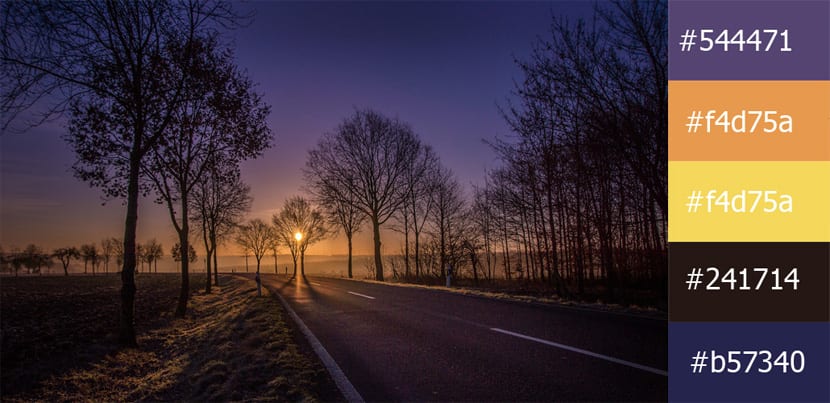
If we go for the purple to orange and yellow, all of them are capable of taking us to a reddish sunset that is reflected in a lake to give a whole scene full of life and colors.
The calm of the Mediterranean blues
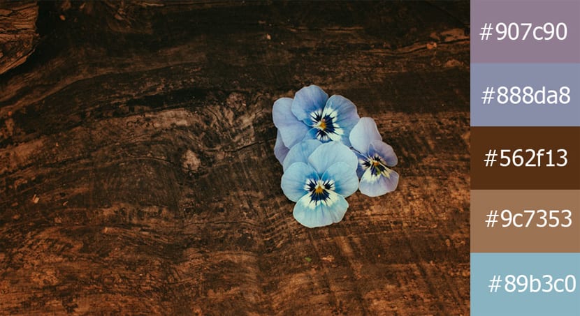
The very light purple tone and a darker one, combined with a brown, we can find a relaxing combination to take it to the Mediterranean and offer enough calm.
The sophisticated and the calm
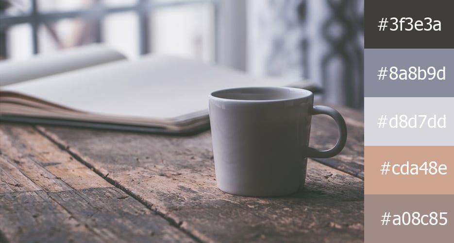
Starting from black to a dark tone and lighter gray, we can choose a dull purple plus a color you see that together can be used to give elegance and showiness to a good variety of projects.
The mountain blues
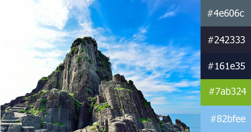
A good range of blue colors with a more vibrant green it can represent a panorama that also offers that calm and conservative side of a design.
Vintage from the 50s
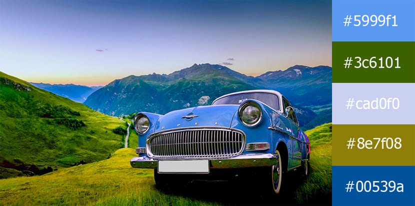
A series of colors that each other they get along very well they are green with a bluish hue, another blue close to green, and one more olive, although very clear, to find a Vintage scene.
Turquoise and red
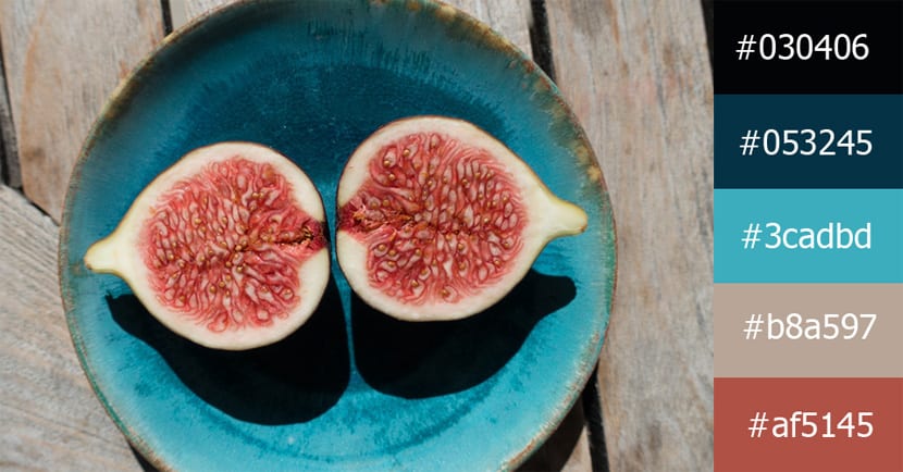
A turquoise blue plus a red becomes a nice combination. Add to the black, a darker turquoise blue and a gray, and the result is a professional match for all types of design goals.
Los 70

Choose three blues that give that aspect that we are in summer, a darker blue almost black and a green to which we have desaturated the color. This mix of colors is very powerful for any type of summer advertising.
The natural elegance of the lands
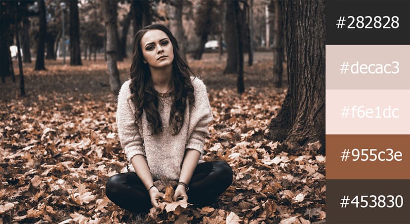
Dark earth colors plus one series of grays and a blackThey are capable of transporting us to harmony to offer the sophisticated.
The sea and sky of the bay
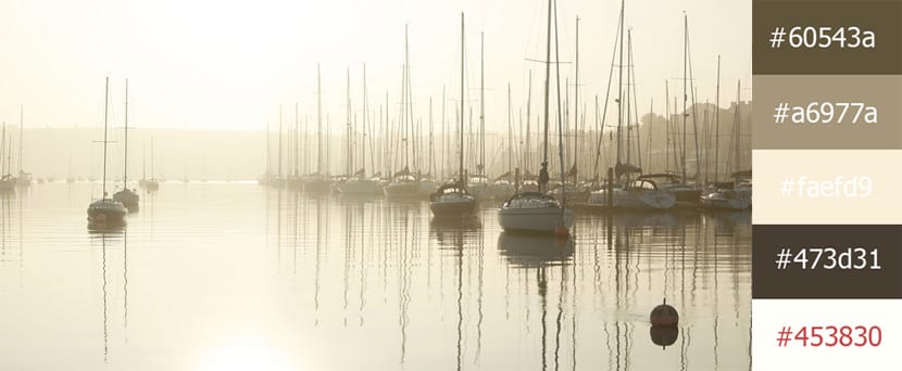
Variations of a same color that cause a lot of luminosity when they are treated in a gradient as in the photo taken.
Very interesting and very practical.
Great post :)
Thanks Mara!
I did not know this blog
Thank you for your work. I keep it to study and have it on hand to work
Merry Christmas