![]()
From Converse it can be said that it is a brand that has been there “all my life”. And it is not for less since it has been operational since 1908. For this reason, the Converse logo has been changing to adapt to the new times.
But Have you ever seen the first logo of the company? And the last one that have varied and that few people have realized it? If you, like us, would like to know more about the history of iconic brands and how they have designed their logos, then find out now about the history of the Converse logo.
What is Converse
![]()
Converse is a brand of canvas and leather shoes, known for their iconic Chuck Taylor All Star canvas sneaker model. Founded in 1908, Converse is an American company headquartered in Boston, Massachusetts.
As we have told you, Converse is founded in 1908 by Marquis Mills Converse. But it wasn't its "full" name, it was Converse Rubber Shoe Company. Founded in Malden, Massachusetts and at first, it was family owned.
They were dedicated to making rubber shoes and boots they were employed by laborers, farmers, and soldiers. In 1915 it is known that, in addition to these shoes, he also began to manufacture sports shoes, although he had not yet emerged. However, it was in 1917 when the basketball player (if that word sounds strange to you refers to a basketball player) Charles "Chuck" Taylor joined the company as a brand ambassador, but also as a salesperson. And that collaboration, in addition to the fact that a "celebrity" trusted their work, made them pay attention to improving the design and comfort of the shoe, giving rise to the Chuck Taylor All Star canvas shoe, which was launched for the first time in 1923.
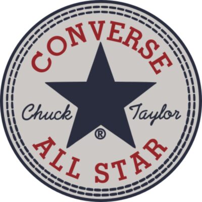
It was precisely this movement that caused them to gain immense popularity and caused the company itself to make a drastic change. Included in the logo itself. To give you an idea, the star that the brand itself wears was not actually part of its logo. It was Chuck Taylor's own idea when capturing that blue star, a symbol that endures and became an icon, especially in the 50s and 60s when all basketball players and rockers wore Converse sneakers from the All Star collection.
In the 1970s and 1980s, Converse expanded further, with a product range that included clothing and accessories as well as shoes. And in 2003, the company was acquired by NIKE. Since then, Converse has remained a popular and recognizable brand around the world, with a variety of products that includes canvas shoes, leather shoes, clothing and accessories.
How the Converse logo has evolved to today
Source: Logolook
As a designer, what may interest you the most is not the history of the company, but its logos. And we're not going to make you wait much longer. In general, we can say that Converse has 9 different logos since it was founded. Let's talk about each of them.
The first Converse logo
As we have said before, Converse was created in 1908. And the first known logo of the company was in 1915. This was quite different from what can be known now. For starters, it had a blue background and a gold border. And inside were, in italics, the whole word, Converse. All the letters were the same size.
The first logo change with Chuck Taylor
As we have mentioned, the acquisition of Charles 'Chuck' Taylor made the company become known worldwide. And that too, along with the release of their new collection, caused them to give their logo a facelift and change it. What did you do? For a start, they added the basketball player's name to their logo, just below the company name. But this is where we can see that a star also started to be added, which was something very player related.
De 1949 a 1967
In 1949 the Converse logo changed again. Until that time there were several versions of the logo that also included the name of the famous player but, after 1949, they decided to simplify it and what they did was put the name of the company, with all the letters the same size and in white italics. , with a red background.
This broke quite a bit with what they had been doing. Even so, it lasted several years until they changed again.
1963 to 1977
Something more than 10 years lasted the following logo. It was quite minimalist since it was a rectangle with a light gray background and a black border. Inside, the word Converse with all the letters of the same size (yes, all in lower case) and, preceding the word, the mythical star that became famous with the player.
Both the letters and the star were also in black.
It was a fairly simple logo, but striking enough and recognizable enough that they had no problem with the change. Of course, in 1977 it underwent a new transformation.
1977 to 2003
The star has always been a symbol that has been linked to Converse. And although it was more of an extra decorative element, the truth is that in 1977 the designers wanted to give it all the protagonist. Therefore, they made a logo with two parts.
On one hand, a square with rounded corners and a black background where the five-pointed star was housed in white. No more. No lyrics, nothing. Just the star.
And, just below, the word Converse, in this case with all capital letters, in sans serif. However, if you look better you will realize that there is a letter that is in lowercase. The 'n', which made it stand out (you don't really realize it until you see that there's something weird about those letters).
2003 to 2007
2003 was a year that he sought to break and start a new journey. And it is that that year Converse was bought by NIKE and that made it have a new registered trademark and, with it, a new logo. In this case, the essence of the previous one was maintained, with some changes. For example, Instead of a square with a white background, a circle with a thick black border was chosen. Inside this was the star, in a smaller size than the previous one and in black.
And below, as it was before, the word Converse, again with the lowercase 'n' while the rest were uppercase. Of course, between letters there was much more space.
2007 to 2011
The previous logo did not last for many years and in 2007 they decided to give it a new concept and, with it, a new logo. This time we know that it was the artist Jim Labadini who designed it. To do this, what he did was put the star, in black, next to a gallon in the shape of an open triangle. This was formed by two wide stripes. We could say that it has an effect as if it were a corner and the star arrives and stands next to it.
Right below we have the letters, in this case with uppercase and lowercase, but much thicker and closer together than before.

2011 to 2017
In order to follow the fashions, Converse continued to change the logo. It kept its primordial elements, like the star and the name, but in this case what they did was use only the name. They kept the lowercase 'n' and small letter spacing. But the most revolutionary thing was the o, which was like a square with rounded edges where, inside, It had the five-pointed star in white.
2017 to present
And we come to the end of the evolution where it's actually almost like a throwback to the 2007 logo because it has the same elements. They only changed the font of the word, and, in this case, all the letters, including 'n', they were capitalized.
What do you think of the evolution of the Converse logo?