
Like any other story of big brand logos, Ford is not far behind in the change since its inception as a brand.. And it is that we all know the current logo and the image of one of the most iconic cars in the American world comes to mind. And it is that this brand grown in Detroit, Michigan has all the style that represents American society. Henry Ford, its creator and where the name of the company comes from, began its activity in 1903. This is the history of the Ford logo.
The continuous innovation of the company, made it expand soon. Controlling brands such as Aston Martin, Jaguar or Land Rover, none of which is owned by Ford today, but which has expanded the possibility of other markets such as Europe or Australia. The company he does own is Troller, which is based in Brazil. Ford's ownership remains in the family although a minority share since it is listed on the New York Stock Exchange and its shares are distributed among different investors. Of course, he has the majority of votes for important decision-making within the brand.
Ford was the first company to create the famous Model T, where the steering wheel began to be placed on the left side of the car. Something that many companies around the world have imitated (with the exception of the British market or countries like Suriname or New Zealand among many others). Ford has created countless models of cars and has sold more than 6 million units between all of them in just one year. The company registered about 144 million revenues in 2015. Also employing more than one hundred thousand people around the world directly and indirectly.
the first logo
![]()
When the brand was born in 1903, a black and white logo was created with the letters of Ford Motor Co.. Accompanied by the city and state where the company was created. This logo was created by Henry's associate engineer, Harold Willis. They created it with a style very similar to the image of companies that existed at the time. Considering its year, there was also no design ability like the current. This limitation also went beyond color and we can imagine what it would be like in print. A sheet metal that would have a great weight.
In fact, the oval had some finials, which seemed to be silver. Much more elaborate than the typography, which was created with a Bold characteristic that was well identified. But like all early logos, they were short-lived to improve their marketing.
Once the brand was already selling its first cars, it went to a totally minimalist logo where it said Ford. Handwritten, with more elegant cursive strokes. This typeface was very identifiable and they placed it on model T car designs. But it was too simple, since in 1912 they changed it again to give it its own identity.
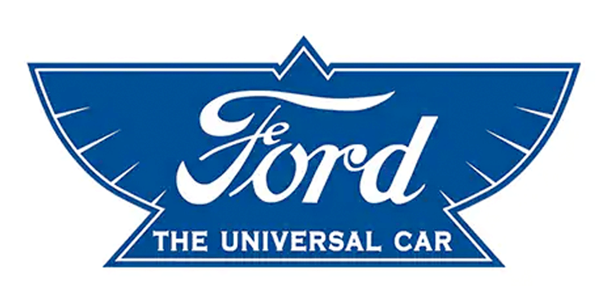
They created a pretentious logo in 1912, which now included the characteristic dark blue color, in the shape of an upturned bird, with its wings spread, under the motto 'The Universal Car' (literally translated as 'The universal car'). As far as the typography is concerned, it has not changed since its creation in 1906, but this logo was not very successful. For this reason and according to the company itself "did not last long" in the market, laying the foundations of what would be the later and definitive logo. (Although this duration was longer than the previous ones since it was on the market for 15 years, now surely a car with this logo is on the rise).
the blue oval
Since 1927 they remodeled the logo, first without color and later adding the blue color, the Ford brand gained international prestige. First on black, with the oval and then, to give their own identity they chose the color 'Royal Blue'. Since then, the logo has not undergone major changes in its design, beyond a superficial modification of colors and adaptation of shapes.
These small modifications are clearly due to the adaptation to the new formats and design rules that adapt to the new audiences.. After 100 years, on its anniversary, they decided to modify it, in 2003, where the design had taken shape through gradients and shadows. There they changed it, including a darker tone and adding shadows to the letters of 'Ford'. And since then it did not receive any modification until 2018.
This modification, like the previous ones, is not very striking., but it did remove all depth from the logo, as marks the current design. This design that we have been able to see in other renowned logos such as Nissan or Firefox We have seen how they have gone from something 3D to some basic lines to represent their image. The so-called flat design and although this change was only aesthetic on the outside, they also had proposals to change the letters.
From Ford they decided that it was not the right thing to do since they are the iconic letters of the brand. These continue to represent the reliability and power of a brand with more than a hundred years which is still at the top of motorsports.
Conclusion
The company has been evolving and gaining more and more market, with the means it has, the logical thing is to have a brand image tailored to it. It is correct that they have not modified the typography, since it has its own identity. But after an evolution of so many years, it would have been necessary to modify certain lines that are too thick or do not achieve a unified ending with the letter.
The brand remains iconic within the world of motorsports but an error has been not to adapt this new logo to the car itself, something that separates from its more modern image in a digital environment, where if that change occurs. In fact, the errors in this logo can be seen at small levels, such as the favicon of their website, where they only place the 'F'.