
Today we are going to teach and value web designer resumes, graphic designers, fashion designers and illustrators. But the (real) examples that we bring could be adapted to the needs of typographers, industrial designers, artists ...
We recommend that you take a look at them and accompany us on this tour, leaving your evaluations and impressions in the comments: it is likely that, on occasions, you do not share our same opinion. Become a selector for a moment. Go for it!
Creative resumes
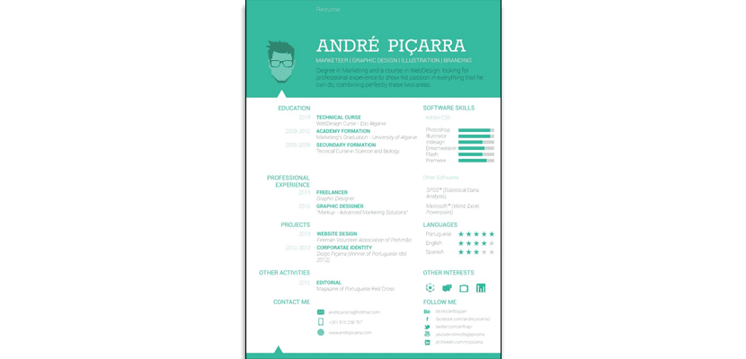
- Curriculum of three columns in which we differentiate the header, in which the author places his name, a vector portrait and basic information (your position and areas of work together with a brief description of what you have studied and what you are looking for). In my opinion: leftover abstract (curriculum in French) and so much info in the header.

Andre Picarra
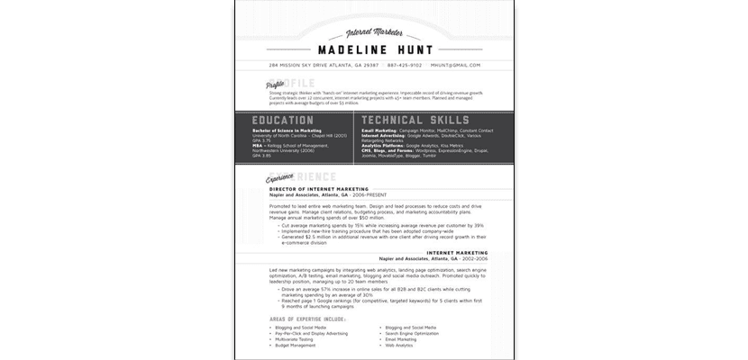
- Curriculum in gray range built in a single column. I don't know about you, but I am bothered by the way you have decided to place importance on your education and technical skills, compared to the rest of the content.
Madeline hunt
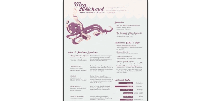
- When you see it, you are interested in reading it, right? Nothing to object to this resume in 3 columns. Only the placement of the illustration...
Meg Robichaud
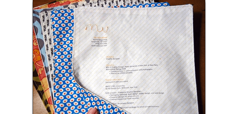
- Great this resume from Melissa Washin. Sometimes just choosing carefully the support we are already making an important difference. Wouldn't you hire her?
Melissa washin
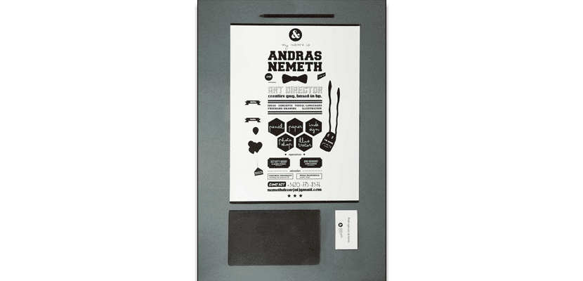
- Curious way of capturing information, which reminds me of the design of phrases and quotes that are so successful on the Internet. A kind of infographic in black and white that the author has decided to also accompany with business cards.
Andras nemeth
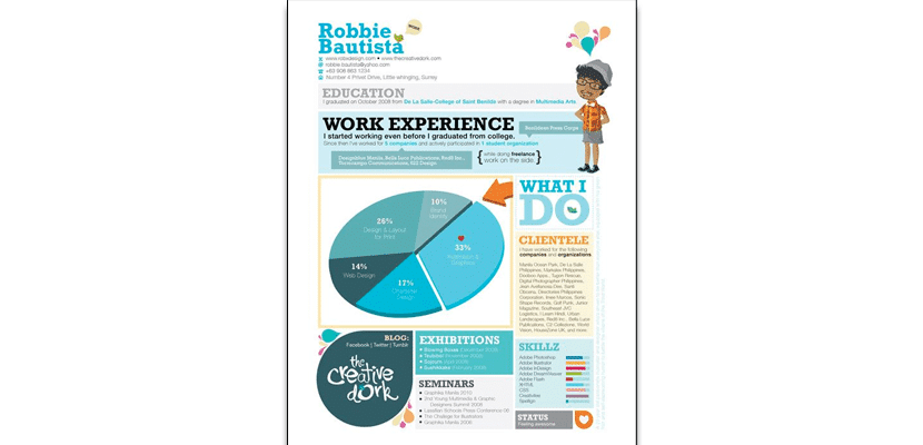
- Robbie Bautista is interested in showing his experience very clearly, determining the category of previous jobs by percentages. An example of how include graphics on a resume.
robbie bautista
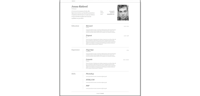
- Web designer who has raised a very comfortable to read template. The curriculum consists of 3 columns and headers, like the first one we have seen in this post. But the distribution of the elements is totally different, in such a way that the eye knows at all times that the important information is in the center of the page. I like it.
Jonno Riekwell
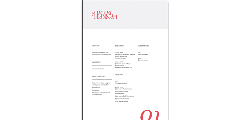
- A little touch of Coral color for a three-column resume.
Sheree hannah
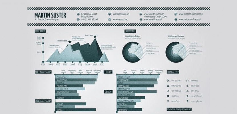
- A curriculum in the form of graphics. Very interesting.
Martin suster
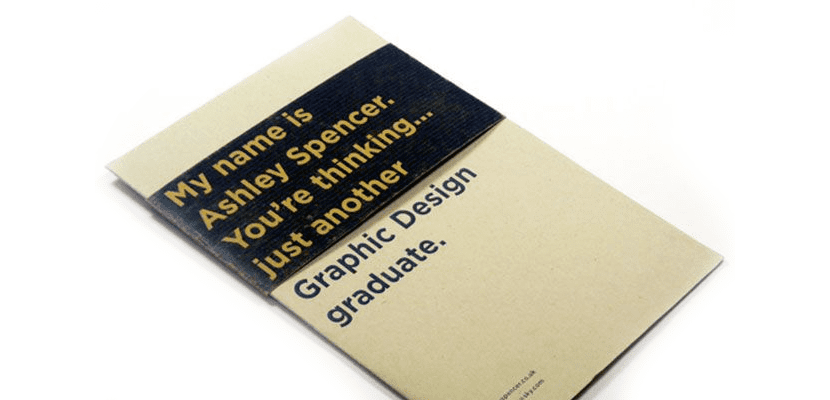
- My name is Ashley Spencer. You're thinking ... Another Graphic Design graduate. » Awesome call-to-action aimed at professionals who are fed up with seeing thousands of resumes of recent graduates.
Ashley Spencer
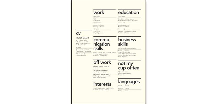
- Many columns have Sayda Muckenhirn's curriculum in which the experience and education are told through timelines.
Sayda muckenhirn
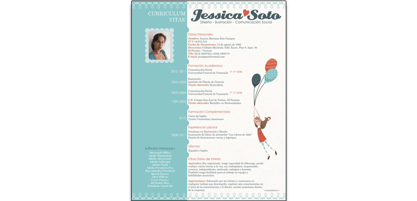
- Illustrator. It's clear, right? Likewise, I have plenty of Curriculum Vitae. Otherwise, great.
Jessica soto
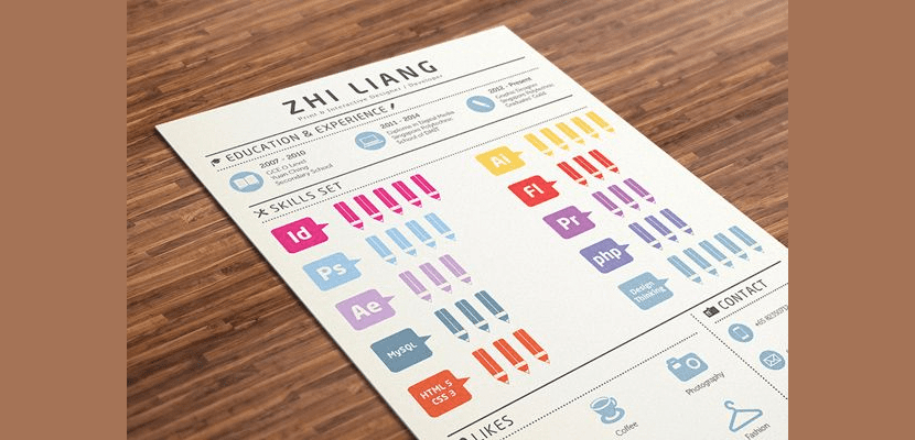
- Zhi has chosen to indicate his skill level by colored icons. Too big for my taste.
Zhi liang
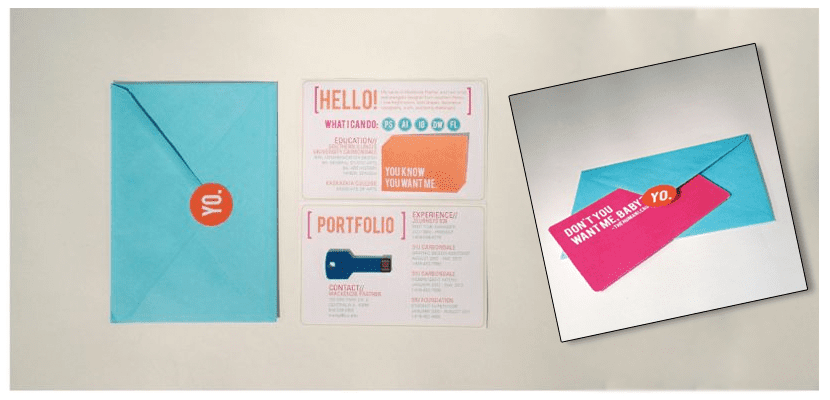
- An informal tone that catches the eye at first glance and a fantastic presentation of a digital portfolio: a key shaped pendrive.
(Unknown author)
- If we substitute CV by the name of the designer… Perfect! What do you think?
(Unknown author)
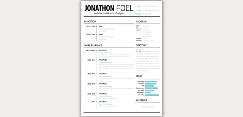
- Curriculum in two columns with header. Its reading is not uncomfortable, and it adds a touch of color with blue.
Jonathan Foel
- Last but not least, Jennifer Cheng's resume. Curriculum with two columns in which the beauty of your logo stands out, without a doubt. What do you think?
Jennifer cheng
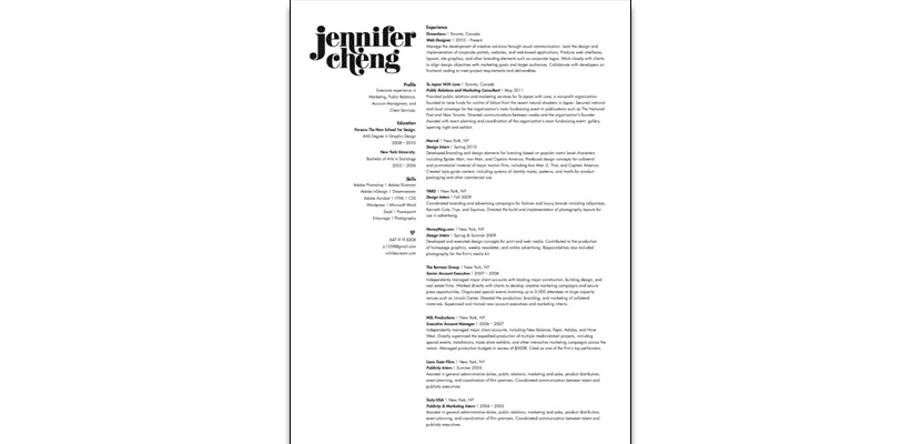
I like Jennifer Cheng's, security without artifice.
The best set of creative cvs I have ever seen. Varied and concise.