To open a restaurant, certain requirements are needed depending on the country. The first thing we must take into account is the cost of everything that entails. Employees, premises, materials, equipment to start and endless bureaucracy and desire. But also, we need a good corporate image. And this image should start with a good logo. Get inspired by these restaurant logos before you start creating your own.
To do this, you will have to know what you want to convey with your restaurant, since not all shapes or colors are for the same target audience.. Depending on the type of product you are going to sell and the price of your service. Since haute cuisine with high prices is not the same as a fast food restaurant such as Burger King. Each one of them is clear about who they are addressing and in some cases, they gradually modify them.
In fact, mentioning Burger King makes us remember the image it had before and where it has moved now. This change is due to the change of public to which it is addressed. Because even if the product is the same, the message you want to sell is different. This is due to the changes in life that people lead and how they perceive one service or another, you will have to take this into account when making your logo.
What to take into account to make a logo
As we have said before, your public. But to know what your audience is looking for, you first have to do a lot of research. Since the message is transmitted by different points. How can it be the color of your logo, the character (if you choose to have one, as in the case of KFC), the shapes, if they are more straight or curved. And also, the slogan. What makes you reaffirm what you are looking for in your clients and what you give to satisfy that need.
- Your brand colors. You must be careful, because the colors are going to define something very important like a restaurant. If you choose a blue color, it is probably the least ideal color for a restaurant. It is the least appetizing and it is very unsuitable for this type of business. If you choose colors like yellow or red, they give a lot of passion and energy. This can be ideal for a fast food restaurant (like McDonald's). But if you want something more authentic, you can play with the green and brown tones that give rise to nature. On the other hand, if you are going to set up a pastry shop, you should use colors that are more like pink or very light blue.
- The shapes of the logo. The forms are also very important, where you can add vitality, strength, speed and many other adjectives. The symmetry in the formation of a logo makes it something classic and serious, for example. If we prefer something more casual, we will have to use rounded corners, which make the image more fun. On the contrary, if you need something hooligan, something authentic, you can use a combination of shapes that make it look like, for example, chopsticks, a fork, etc. (as it happens with DiverXO)
- The brand slogan. This must be linked to the philosophy of your company. In the end, you must take into account that this element must be the last to be placed. Since to define it you must be very clear about what you wanted to transmit and if you have achieved it with the previous steps that we have indicated.
The different examples of fast food restaurants

As we have explained with the example of Mcdonalds or Burger King, we can see how fast food restaurants always choose the same shades. In fact, both brands have wanted to separate themselves from it due to the poor condition of "junk food" for which it has received innumerable criticism. That is why both brands, each in their own way, have opted for colors more linked to nature, such as brown and green.
But still, we can see how the red color has been the common thread of all these restaurants. Since it has not only been these two hamburgers, but there are also many others. And to name a few acquaintances, we can say which is also KFC, Pizza Hut, Telepizza or Five Guys. But there are also other fast food restaurants that have tried to separate themselves by using other colors that evoke the same thing, but that are different.
These marks can be Taco Bell, where he has chosen a brand with an electric purple color. Or the SubWay brand of snacks that have a green and yellow color. In addition to these vivid colors, the chosen electrical hue also determines that energy and speed we are talking about. That is why many of its spaces are linked to signs and light bars that indicate each of the restaurants.
Elegance, minimalism and black color

If in your case you are a Chaute cuisine hef, with great creative ideas about the kitchen, your logo should not have any of the colors mentioned above, let alone their hue. At least not directly. For haute cuisine restaurants, where the menus are quite large and the quantities are somewhat small, the logo must express that minimalism, cleanliness and neatness.
Black and gray colors on a white background are ideal. But you can also choose some golden tones to give it life, in a testimonial way integrated into the logo. This can indicate a high-class kitchen and a restaurant that must be up to the task. In this case, a tagline may not be necessary.. Since the name of the Chef, his food and the luxury that is breathed in the restaurant environment should be enough.
The traditional neighborhood restaurant

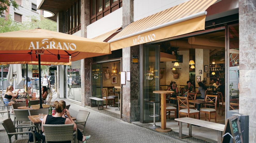
If, on the other hand, you don't know what type of kitchen to set up and you prefer to set up something simple, recognizable and at moderate prices, you can set up the typical neighborhood bar of a lifetime. Where the food is homemade, good and at a great price. For the logo of a bar of this type, you don't have to think muchAlthough it is true that now giving identity is important in all areas.
As long as the name of the bar is not "Bar Antonio" (which is very seen) you can find a simple way to convince with your logo. The colors can be both black combined with yellow or red, as well as restaurants with green colors. Attributing to your product naturalness and closeness. The slogan could be something like "Just like at home" and you would have a traditional bar with a very close audience.