
Many times we can come to think that a logo was almost born as we know it today, but it usually happens that it takes a process over time that, in many cases, is usually very striking. It will not be the first time that the evolutions and concepts of logos of different brands have passed through our pages, like Adidas, which have been improved to be more up to current trends or give it a good change to propose other ideals closer to the services they provide.
Uno One of the clearest examples of this is the history of the Google logo, one of the technological giants that has had a very interesting journey through time to study some of the most important changes in the logo. For this reason, we are going to know the most important stages of the logo that has taken time to become that which it is today and that is well engraved in the minds of millions of people around the world.
The beginning of the history of the Google logo
The company started take your own entity as early as 1997 when it emerged from that earlier name called "BackRub." In all these years, past twenty years, this company has gone through 14 changes to reach the logo that we all know today. With this we make it clear that it has not been a flower of a day, but that its future has been worked on for a long time.

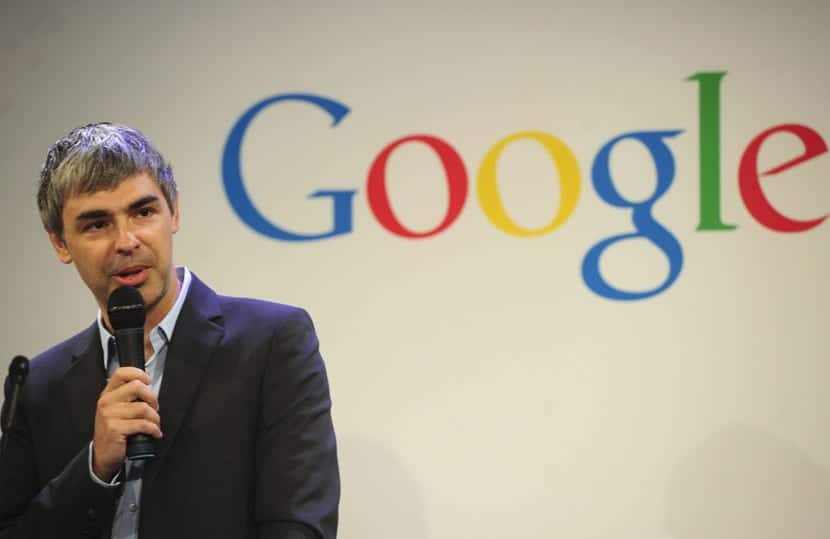
It was in 1997 when Larry Page and Sergey Brin, the thinking minds behind the big G, They decided to give that "BackRub" logo a twist and come up with the idea that would give color to the first Google logo.
This logo was first found on the servers of Stanford University and it was fortunate to last a whole year until it received a touch-up in 1998.
1998, the year in which Google is taking more color
Of those more bizarre letters, with colors that seem taken from a very basic Photoshop template, we find that the typography has been ordered and everything takes a shape more rectilinear to appear fully centered logo.

A new change that would go hand in hand with the events of the company that it was taking another path and that shows that logo very well, with those striking colors, but with straighter shapes.
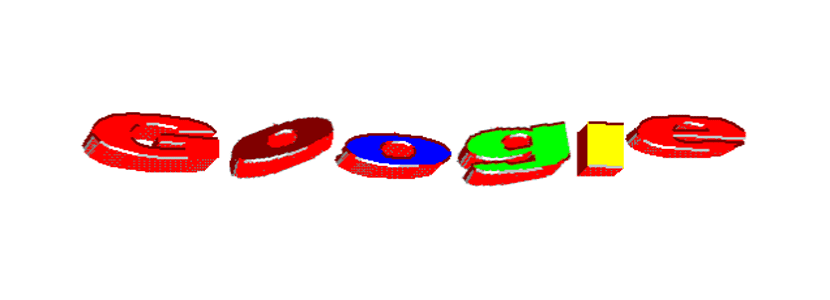
1999 is the year of shading and 3D
Google passes to select shading and a 3D effect that allows a glimpse of the evolution from those shapes of last year's logo. These effects provide another feel to the logo that is transferred to the objective of the primary colors of the color wheel. Ruth Kedar came up with those colors well in order to have a company with a fuller sense of fun on her hands.
More specifically, in Kedar's own words, the idea was to show that Google did not follow the rules of others, and therefore the change in the secondary color of the «L».
One of the obvious differences is that the «G» changed to blue and the only letter that stayed with the green was the "l". A pattern that continues to this day and that has not changed since that year.
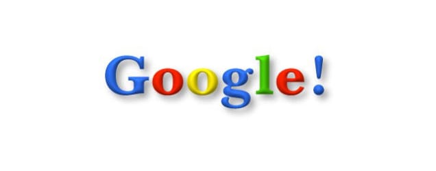
1999 and we continue to grow towards domination
The most curious thing about this year is that the Google logo, in another very interesting change, offers the image that the big G gives to the world when it begins to take the position for total global dominance as a search engine.
A year in which different concepts were seen, among which is one in which the black takes great prominence and the first vowels intersect between them with the colors that we all know.
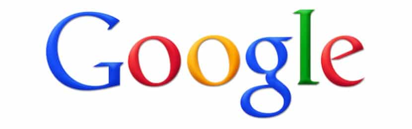
Surprise in the end that the big G took the decision to make everything simpler with a logo that it is the same as always, although with more stylized lines, the shading in a better way and the colors well known by all.
Our we will stay with this logo until 2010 and as a sign of the important moment that the company was experiencing to become the search engine par excellence that would change part of the tasks of millions of people.
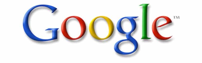
From 2010 to 2013
The Mountain View Boys remove the shading and leave your stylish logo with the colors always, even to brighten the tones so that they look better in that change in three years
Spot colors from 2013 to 2015
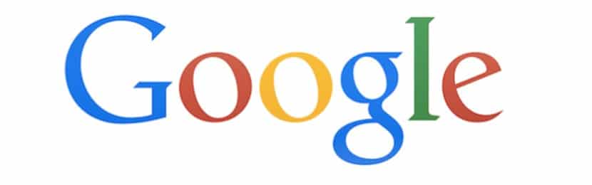
Another change for the Google logo to be before the design standard of those years in which spot colors took center stage in many applications and services.
This modification was also carried out to the font itself to that the corners were smoother and to make it easier to read when users started using millions of smartphones around the world.
And 2016, current Google
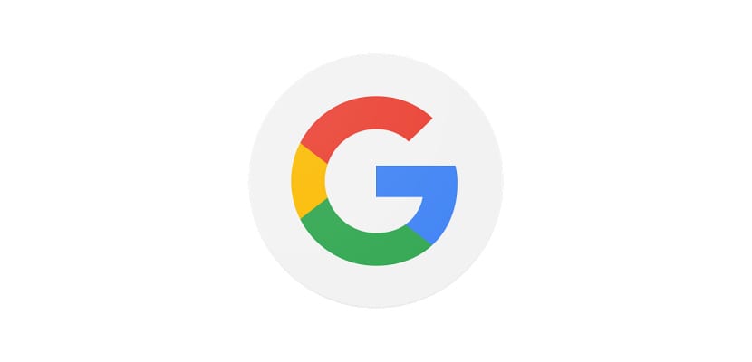
Last year we saw another big change so Google was defined in a single letter, the "G". Take all the colors combined and stick with the spot colors to serve as brand identification.
A change in the logo that shows the future of the company that holds the SO for mobile devices most installed on the planet and that is changing the face of the planet with its most interesting ideas towards Deep Learning or the capacity for natural conversations thanks to the context of its Google Assistant.
And not everything will stay here
We can pick up some principles from Google with the evolution of your logor. The main one is that continuous change that we have also seen in how it has gone from a search engine to what different operating systems are to dominate mobile devices such as smartphones today.
It is clear to us that Google has played its cards very well and the change in the logo shows those important changes. We have even witnessed the creation of Alphabet, another mutation of the company towards other parts and that will have its greatest role in the coming years.
Did you like the history of google logo? How do you think it will evolve in the future?