
It sounds familiar to you, but you don't know what. Or you've seen it somewhere, but can't explain its meaning. Or you don't remember, and you gave it not long ago (or a few years ago) in class. Relax: you are not the only graphic designer who does not know very well what it is kerning.
In this post we refresh your memory with a basic explanation of what it is, what it is for and how you can modify it. I hope that, after reading this post, you achieve better layout your text taking into account kerning.
What is kerning?
The term kerning is used to refer to the existing space between pairs of letters. You are probably thinking that if you had not heard of this before, the logical thing would be that there is the same space between all the letters of a word. If you pay a minimum of attention to the typography, you will realize how wrong this belief is: since the shape of a letter determines the perception that we have of the space around it. It is not the same to have an M and an N, than a W and an O. In the following image you can see that, with the two pairs of letters with the same space between them, between the W and the O we seem to have a little more air.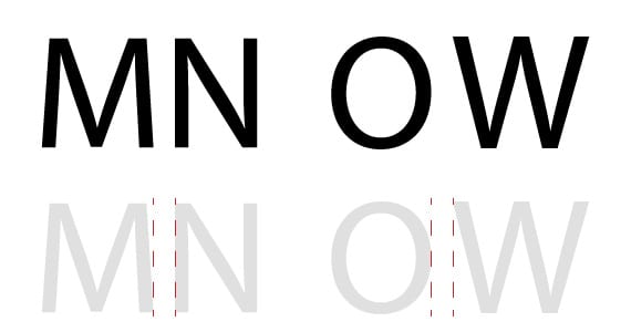
Good fonts, those that are well designed, usually require very small adjustments of kerning. However, it is the bad ones that will require more manual kerning manipulation by the designer. Here I would like to make a point and advise: most of free fonts (eye, not all) will give us war with the issue of the space between pairs of letters.
If you handle InDesign, you may have never wondered about this icon that you must have seen on some occasion. Yes, it is the icon referring to kerning.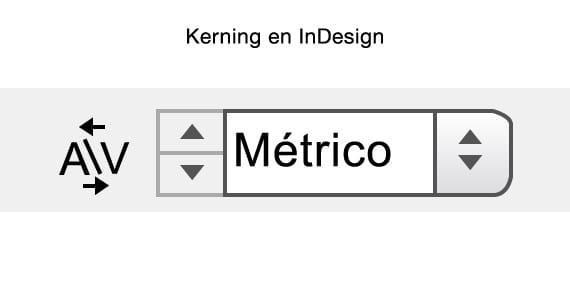
To modify it, we have the value 0 (to leave the spacing as it is) or we can choose between several negative and positive values that amount from 5 to 5. With the negative values, we will reduce the distance between the letters; with the positive values, we will increase it.
Differences between optical kerning and metric kerning
And what about the other two non-numeric options? It is very common not to know exactly what the difference is between the optical kerning and metric kerning: what are they and why do they define different spacings? The first one is executed automatically by the design program we are using (such as InDesign). Calculate the space you think is convenient and apply it for us. Some designers use this option to fine tune their document headlines; however, for running text, they prefer the metric kerning. This is the spacing that the typographer thought about when designing his typeface. At small sizes, it is usually well balanced.
When, then, should we use manual kerning? Well, when none of the above options convince us (which can happen).
And you, did you know what it was? Have you adjusted the kerning of any text before? What is your experience? Remember that you can use the comments area at the end of this post to contribute your impressions.
More information - 10 free fonts for your use and enjoyment
Thanks for the post. I was unaware of the meaning of the term 'kerning'. Greetings and congratulations.
I'm glad you liked it, Zulemo. Greetings and thanks to you for reading (and commenting).
Excellent! Thank you!
very good article, I always apply it but did not know the concept.
Thanks for so didactic explicacon about kerning. Generally I use it intuitively, but now I have the correct theoretical foundation Jorge, from Salta, Argentina.