Today there are many artists and designers who already forget to put a watermark on their work that they will later sell or show in digital media; such as Instagram, Facebook, Behance and many others. This is because design work is usually better displayed without adding any extra that manages to "distract" the gaze of that future client, although it can always happen that someone happens to make a fraudulent use of an image made by us.
There are still many who put their watermarks and, therefore, we are going to show you how to put it in Adobe Photoshop, plus what would be some detail to take into account. We are facing a situation that it has more to do with the position, size and opacity of the watermark, that of the own technique in copying the logo and pasting it to the image. So let's get to it with the watermark in Photoshop.
How to put a watermark in Photoshop
We recommend that you go through this tutorial so you know how to remove the background of an image (remember to save it in PNG), in this case the logo, although we assume that you have also passed by a logo generation website that, by default, already allow you to download the logo in PNG.
- The first is have our logo in PNG format with transparent background.

- Control + A to select the whole image.
- Control + C to copy the selection.
- Control + V to paste the image that we want to protect with our watermark.
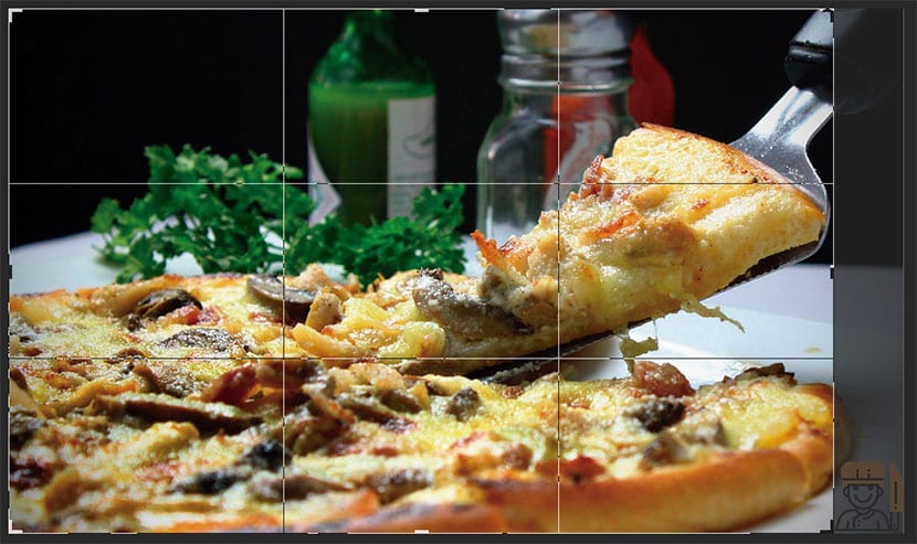
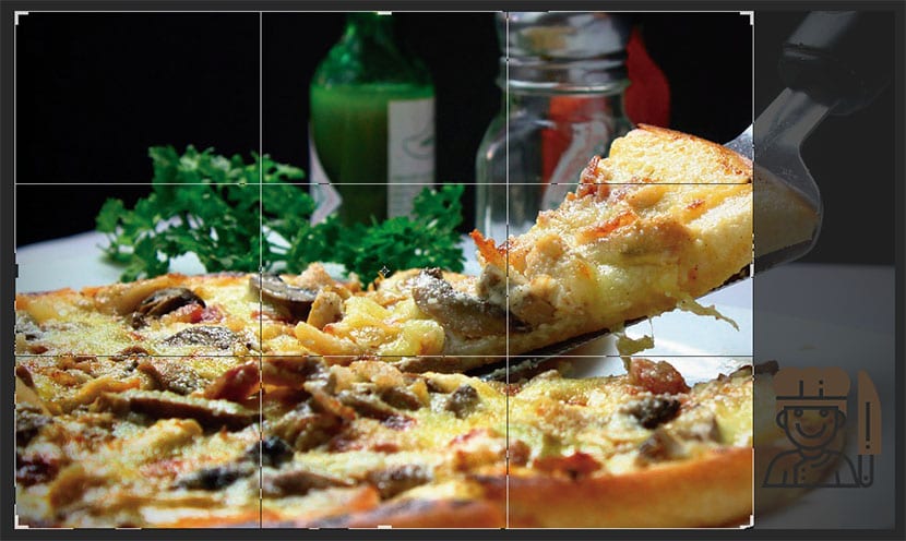
Already placed with the watermark as a layer in the image that we want to protect, we must understand what is the part we are most interested in «caring for». In the photo of the pizza that you can see below, since the portion and the pizza itself are what most attract the attention of the photograph, we must take care to place the logo vertically and horizontally so that it is difficult to cut that image without take one of the "visual focuses" ahead.
These two examples show what was said well, an image in which the logo is well located, and ensures that the cut to be made is worthless, and another logo, which due to its poor positioning and how small it is, allows them to cut out an image that is worth it .
Badly located by allowing cropping an image that looks great:

Well located By not allowing an image to be cropped, which is cropped is not worth it:

- We place the logo in verticality and horizontality of the "important" of the image.
- We go to the opacity of the logo and lower it enough so that it is not noticeable much, although it is visible if one looks better at the photograph.
- We can resize a bit so that the logo is not so present.

Ya we'll have the cleverly placed watermark ready so that that "little thief" is not able to steal the most important part of the photo, which in this case would be what was said about the cut-out portion and the pizza itself.