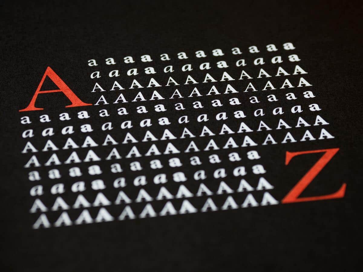
Graphic designers are professionals who give great importance to the choice of fonts, as it is often the main basis of a design. Choosing the right typeface for each design will often help make the difference between a normal design and a professional one. Typography also helps to communicate different emotions. There are different typographic categories, the best known are: Serif, Sans Serif, Handwritten and Decorative.
These font groups have different characteristics based on font shape, size, weight, and character ratio. Depending on the font you are going to use, you will convey one emotion or another. Well typography and, after all, it is the central structure of the design. In today's post, we are going to explain and publicize serif fonts and when it is advisable to use them.
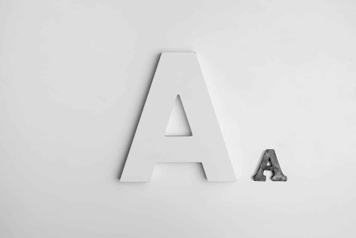
What is serif typeface?
The serif typeface is one that has a serif or terminal, that is, small details at the ends of the letter strokes. This type of typography has a serious and traditional character. As for its origin, according to an ancient theory, when using tools such as brushes or pens, the scribes left "signs" at the end of each stroke. Over time, these strokes became more artistic and ended up becoming an essential part of this type of typeface. There is a wide variety of fonts within this style such as ancient roman, modern roman, slab and egyptian.
Some of the best known serif fonts are: Book Antiqua, Courier, Courier New, Century Schoolbook, Garamond, Georgia, Times, Times New Roman, or Palatino.
Serif font styles
The classification of serif typefaces was determined by Francis Thibodeau. It was based on the link established between the serif and the antlers. Based on this, he determined the following styles:
Ancient Roman: there is almost no difference between the antlers and the serif. The link they present is rounded. Its termination is acute and its base is wide. The strokes vary, and are thin ascenders and thick descenders. As for the axis direction, its thickening is oblique and the letter space is quite wide. In this group can be included: Garamond and Caslon.
Transitional Roman: the difference between the thickness of the horns and the serif begins to stand out, the connection they have is circular. The serif has a much sharper ending than the previous ones. The strokes also vary, but instead, the differences between thin and thick are more pronounced. The direction of the thickening axis is more horizontal than oblique. Some transition roman typefaces are; Baskerville, Times or Century.
Modern Roman: in this style the difference between the antlers and the serif is much more noticeable, with a straight connection since the serif of its letters is linear. The strokes are much more variable than in the case of transition romans. We can consider as modern Romans the Bodoni, the Caxton, the New Baskerville and the Didi.
Egyptian: the value of the antlers and the serif are flared and have a circular link. The serif is as thick as the canes. Depending on the typeface, it can be square, like Robotik, or round, like Cooper Black. The axis direction of the thickening is usually horizontal.
When to use serif typeface
There are multiple uses that you can give to this type of fonts, it depends on the aesthetics and function that you want to give it. Well lserif typefaces also have a functional value in the text, as I mentioned before, they are the most suitable for long and small texts. We can see them mostly in printed newspapers. If what you want is to convey tradition, classicism, elegance or seriousness, serif fonts are the ideal typefaces.
These are some of the factors that you have to take into account when choosing one type of font or another:
Text length: As I have already told you before, serif fonts are ideal for the use of texts with a reduced size and that have a long text extension. Surely if you are currently reading a book, the font it contains is serif.
Public: Fonts convey emotions, so not all of them are aimed at the same target audience. Just as color is important, the shape of the font will also help define your target. In general, this style of lettering is used for more serious and formal companies, such as lawyers. Although they are also used in more sophisticated sectors, such as luxury beauty, fashion or automobile brands.
Support: The most used formats are the printed media that contain long texts. The same happens in online media such as blogs or articles.
Separation: the spacing between characters is also important, fonts that are very condensed are not recommended for reading, it is something that you should take into account.
Layout: Depending on the layout of the texts, sometimes it is interesting to combine serif fonts with san serif fonts, to generate contrast and that the text is not so monotonous.
Here is a link to another post about the most used serif typefaces. I hope this article has helped you learn a little more about serif fonts, their styles, and when to know how to use them.