![]()
Slack is the communication tool for professionals par excellence and in a matter of a few years it has been able to establish itself as a solution for all types of companies, companies, work groups and teams.
Yesterday updated with a new logo which gives a lot of fresh air to what has been their logo almost since it started. In this way, it takes care of updating itself so that it continues to offer that imprint of a tool that facilitates workflows in different work environments.
And while Slack, as they claim from their blog, they loved their old logo, have had enough courage to take a step forward and evolve in design, without losing its essence.
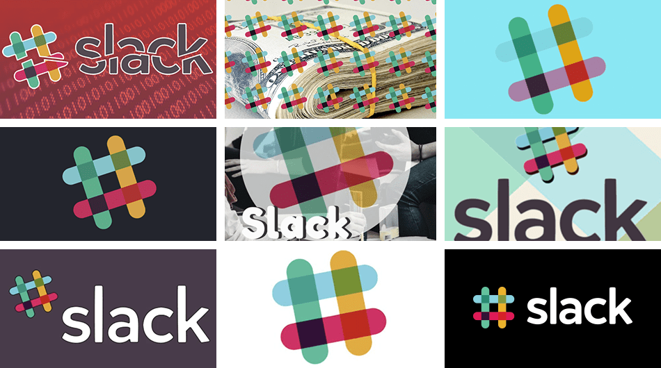
Slack warn that it is not a change because they wanted or gave them an air one morning in January, but served a goal. As they claim, their first logo was created before the company itself was launched. It was in its different and joyful time, and what was the "octothorpe" emphasized everything that many users have felt when they began their journey with this tool.
In that own evolution as a company the logo has also been changing. Even though it was a good logo, it wasn't cohesive enough, and it didn't have that feeling of reminding you that you were on Slack; at least what they say, because to tell the truth it is very easy to relate it to the tool.

They have been the designers of Slack and that have worked with Michael Bierut and the Pentagram team to create the new logo. Simpler in its color palette and more refined, without forgetting its own essence. an evolution of its own for a great logo and for a great communication tool.
![]()
Un good time for many companies which They release logos like Uber.