
Erik Spiekermann is one of the most recognized typographers on an international level. Some time ago, this typography professional gave in to Font Shop a PDF file very educational that aims to guide us in the correct use of certain typographic elements.
Then you will see, in our graphics, the 8 typographic tips that Erik Spiekermann gives us to make a good design / layout. Attentive:
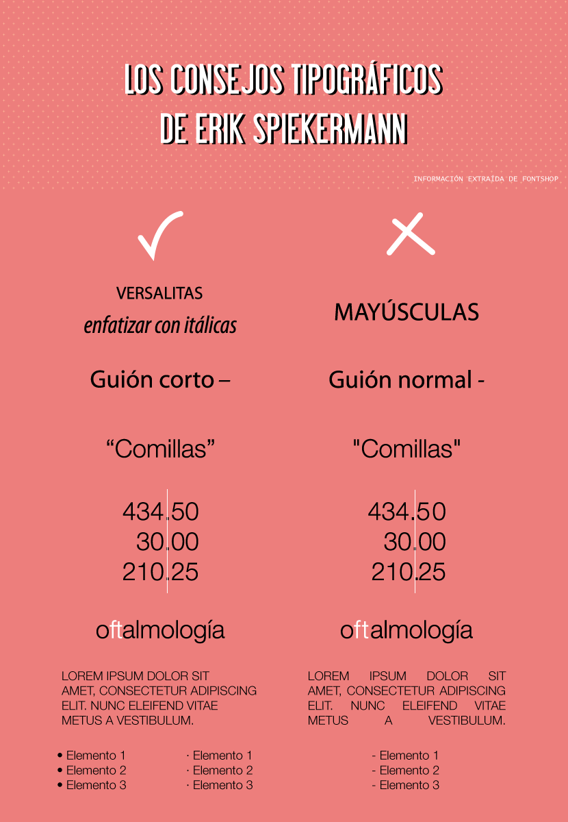
Spiekermann's 8 Typographic Tips Infographic
-
Use small caps instead of capital letters
And here we must point out. Substitute capital letters for small caps in those places where you have to mention an acronym or an abbreviation, as in the case of CD-ROM or in the file formats PNG, JPEG, PDF… How do I use the small caps? Select the word you want to convert. In both InDesign and Illustration, open the Character window (Window Menu> Type> Character). Go to the upper right corner of said panel and click on the icon that shows us an arrow and some horizontal lines. Once there, click on the option "Small Caps" (in English, Small Caps).
-
Use italics for emphasis
If you want to put emphasis in a certain word of your text, do not use capital letters. The correct thing to do is to use italics.
-
Use the dash instead of the normal dash
By default, when we press the script on our keyboard, the one that comes out is the normal one. But Erik Spierkermann recommends us use instead the dash ("em dash")as it considers the length of the former a distraction. What combination of keys should we press to achieve it? Simply press Alt along with the dash key on mac. On Windows, Ctrl + dash key.
-
Curved quotes, please
There are different types of quotes: the apostrophes, which are the straight quotes, the curved quotes that remind us of the numbers 66 and 99; and the Spanish quotes. By default, probably, when you click on the quotation mark, what you are actually getting are apostrophes. How to apply the correct ones In Illustrator, go to the File menu> Document Setup. In the lower section of the window, click on the Use quotation marks option. Then choose the language in which you are going to write (in our case, Spanish) and select the corresponding icon with curved quotes (the first in the dropdown list). To finish, press OK.In InDesignIf you have a mac, go to InDesign> Preferences> Dictionary. If you have Windows, go to Edit> Preferences> Dictionary. Choose a language in the language menu, the one that corresponds. Then, in Quotes, select a pair of double quotes. In a much faster and more comfortable way, to activate or deactivate the preferences option Use smart quotes you will have to press the following keys: Shift + Ctrl + Alt + '(Windows) or Shift + Cmd + Alt +' (Mac).
-
Elzevarian numbers and tab
The Elzevarian numbers They are those old-style, low-box figures. These fit the text much better. In the use of decimals, special attention must be paid to match, in the case of the list of figures by columns, the placement of the points (as you can see in the infographic). To rectify its position it is necessary to try to tabulate the points and take into account the width of each number.
-
Always use ligatures
Ties improve readability of a text, so it is necessary to activate them whenever we can. It is necessary to know in advance that not all fonts allow the use of ligatures, because they do not contemplate them: it happens especially with free fonts, which lack them. turn on ligatures in InDesign? Select the letter pair you want to apply ligature to (for example, ff, tt, ft…). Open the Character panel (Window> Type> Character) and in the upper right corner you will find an arrow with lines. Press there and activate the option Ligatures. And how are the ligatures in Illustrator? Select the letter pair you want to apply ligature to (ff, tt, ft…). Open the Open Type panel (Window> Type> Open Type). If that font supports ligatures, you will be able to select the first icon you see in that panel that has the letters fi.
-
Left aligned text, NEVER justified
Justify a text Using the option that bears such a name that we can find in many programs (InDesign, Illustrator, Word, PowerPoint…) is the worst typographic decision we can make. What it does is create hideous vertical white spaces in the middle of the text known as rivers. It negatively affects the readability of the text, among other things. What we are advised, always, is the use of the aligned to the left. Manually generating justified text is an arduous task, influenced by the size of the page, the column, the font and the shape of the letter itself; talented, precision work that only a few professionals can brilliantly execute.
-
Lists with points
Don't use hyphens in a listing. Erik Spiekermann recommends the use of points, the size that suits us best. To apply them you can try the following key combination: • Alt + 8 (Mac), Alt + 0149 (Windows)
Alt + Shift + 9 (Mac), Alt + 0183 (Windows)
I get the feeling that the translation of the infographic has some errors.
By the way guys, the "Use of cookies" notice occupies me half the screen on my mobile.
I think that in the infographic, the last point, recommends the hyphens for a list, and not the points;)
Fixed infographic bug, thanks for warning!
I love tables / schematics! very nice detail in the article :)
Eye; although his advice is very good and generally valid, Spiekerman uses spelling standards for English. And there are notable differences; for example:
• In Castilian (or Spanish) the hierarchy of quotation marks would begin (and this is so often ignored that it is already considered by some authors as an option) with the «Latin» quotation marks, followed by (if it is necessary to reopen quotation marks before having closed the first) the "English", and finally (if it was necessary to reopen quotes for the third time) 'single quotes' would be used. An example: Benito replied: «then he told me 'you should go' and I listened to him».
• Another difference (subtle): in Spanish the lines that mark a subsection —exact; the «em dash» is called a dash, simply, not a short dash - they are placed without space with respect to the text of the subsection (-so- and not -so-).
• Another one: The bullet or bullet (•) is actually used for enumerations, but the blown point or midpoint (·) is not.
I know that these things may sound strange the first time they are seen, but in reality what happens is that the lack of knowledge (or interest) about orthotypography leads us to commit and see as normal what in fact are errors. It would be something similar to, for example, writing "Mejiko" or "Vilvao" or "hautomobil" for "Mexico", "Bilbao" and "automobile" and, by repeating the error, making it seem correct and normal (and in fact, if it repeats long enough and spreads, it could be, but that's another matter.)
There is a quantity (not excessive, it is true) of books on this subject (orthotypography); And it is good to have some on hand if you are, even at times, involved or interested in the profession of typesetting.
Hi Dani, thank you very much for providing such an interesting comment. With your permission, I am going to make a series of modifications to the post based on your knowledge. One question: if the flown point is not used for enumeration, what is it used for then?