When we have to start a project, we are forced to end the reign of the void. TO fill our blank sheet to be able to represent something. It is then that we fix our eyes on the elements that we are creating, and we forget the space that we have decided to discard. Yes, from negative space.
And perhaps we should, from time to time, change our way of approaching a new project; and take into account the void, as it can help us shape our image. And if we do, we may get a doubly shocking result. As they have done in the following 13 examples: to see and learn.
13 Examples of Good Use of Negative Space
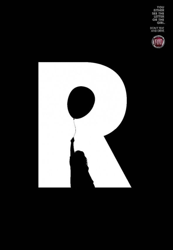
- FIAT: Either you see the text, or the girl. Great awareness campaign to prevent drivers from sending text messages while driving. Very clear and direct.

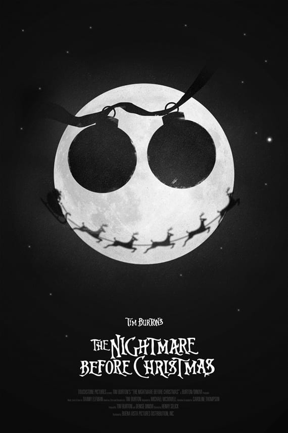
- Nightmare Before Christmas. An original design of a well-known film, of which you have surely seen thousands of posters. This one is out of the ordinary.

- Good food choose Bourdeaux. A very appropriate image to say so.

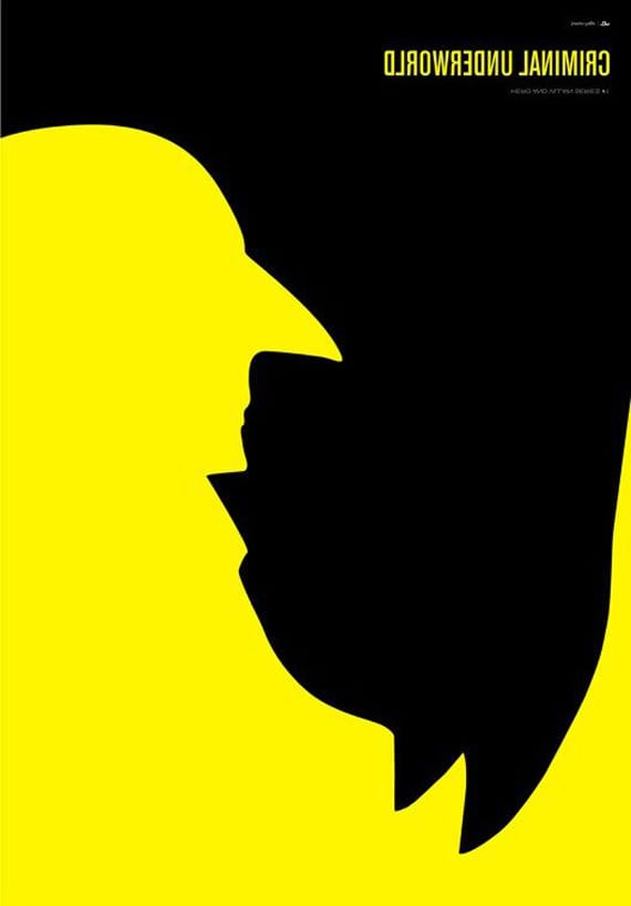
- Great image of Simon Page, perfect for any movie starring Batman.

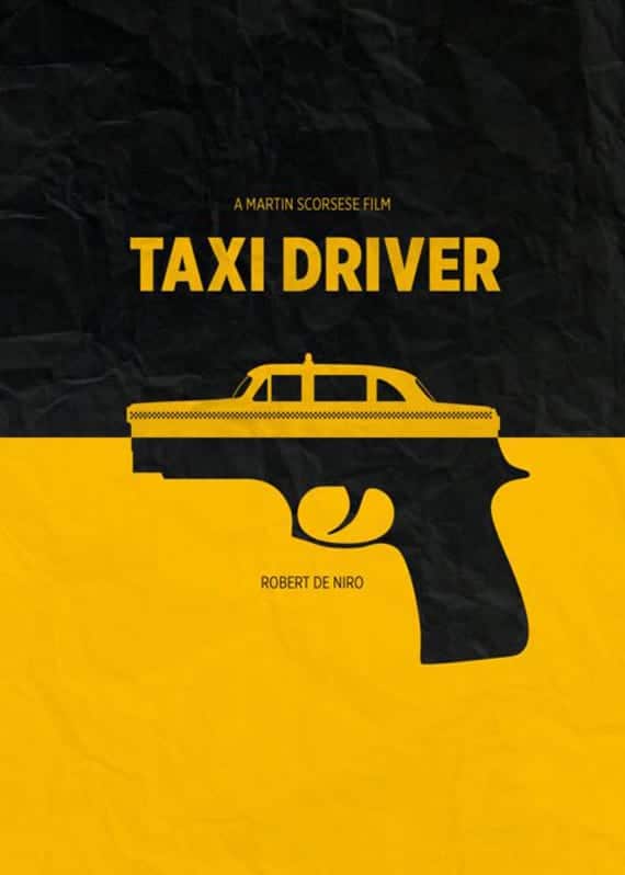
- Taxi Driver. Anything else to add?

- With this poster, we can already imagine a story and its main characters. Or not?

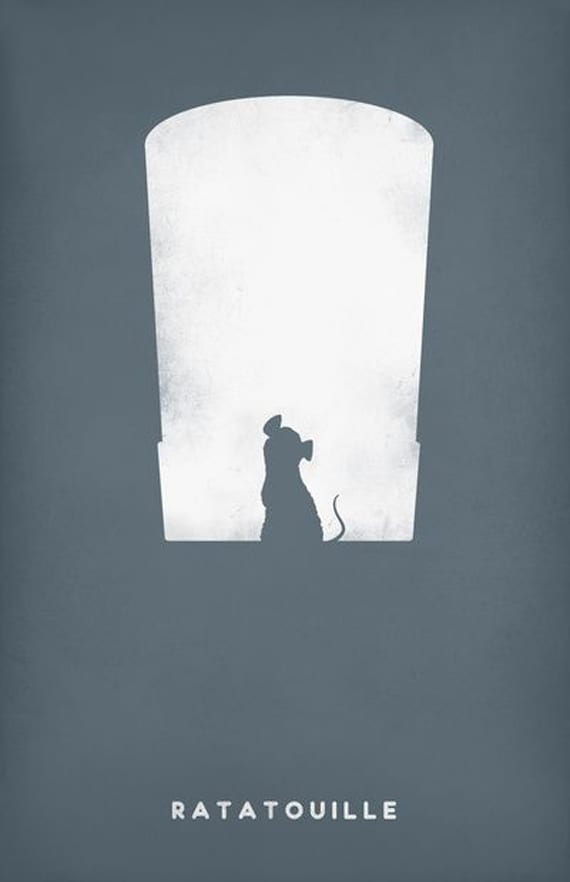
- Poster in honor of the movie Ratatouille, made by PANDREAA.

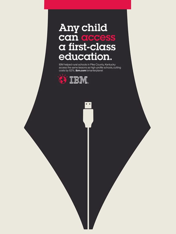
- Very clear IBM campaign in favor of the right of all children to have a school education.

- Another IBM announcement to disseminate the collaboration between said company and the Extremadura Health Service, which results in all doctors getting to know their patients better.
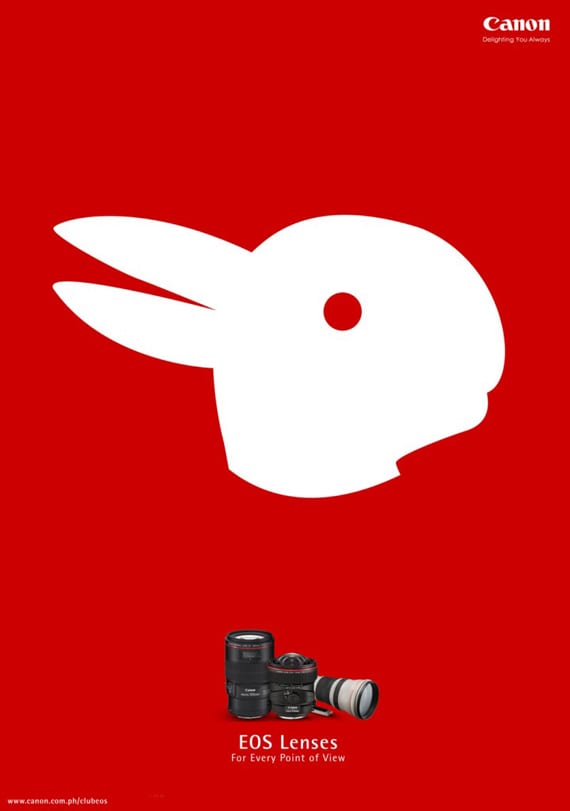
- Perfect Canon ad. The motto: glasses for any point of view. Can you see the two animals in this post?

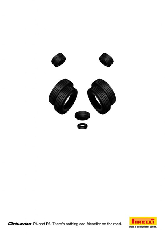
- Surprising and fun advertisement from the Pirelli tire brand to announce a new model. They say that there is nothing more "friendly" and ecological than them.

- It is usually not easy to propose a poster design to raise awareness about female abuse. This proposal flees from the traditional and stands out.

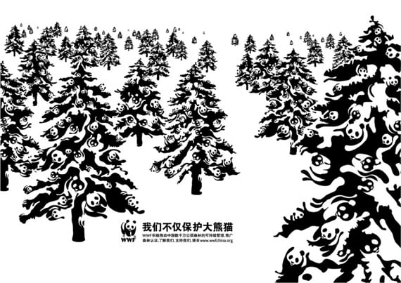
- Fantastic advertisement for WWF created by the agency BBH China.