There are millions of brands in the world, some smaller ones that are concentrated in a single region and others somewhat larger that reach an entire country. Or go around the world. Whether it is a cosmetics company, a social network or from the radio of a country, as is the case. The image of such a consolidated company that has remained at the top for so long always needs a makeover and here we are going to show you the evolution of the 40 Principales logo.
And it is that, as we can see, so much has changed since its inception, that today it is no longer called the same. Although the general public, to recognize him, continues to call him Los 40 Principales, his last name has disappeared, thus leaving Los 40. This and many other changes he has undergone to adapt to a world that for a time left traditional radio aside, but now with the podcast format it makes sense again.
Origin of the 40 Principales
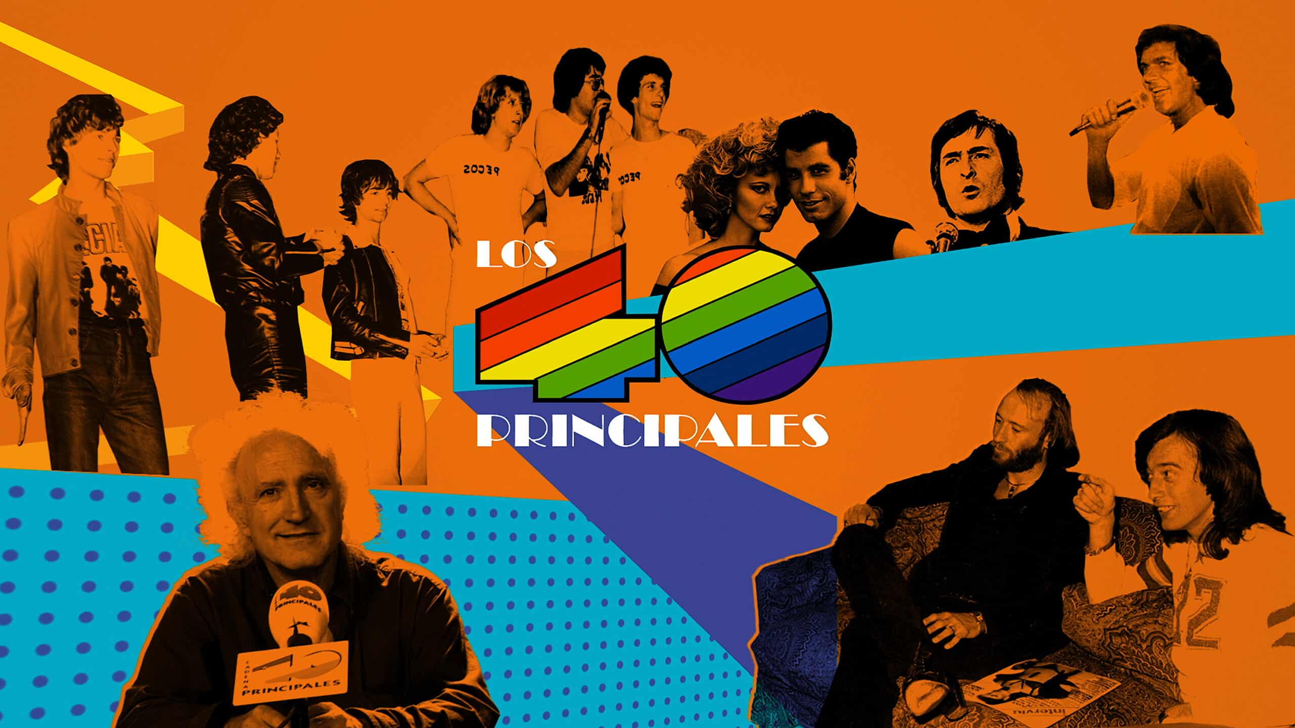
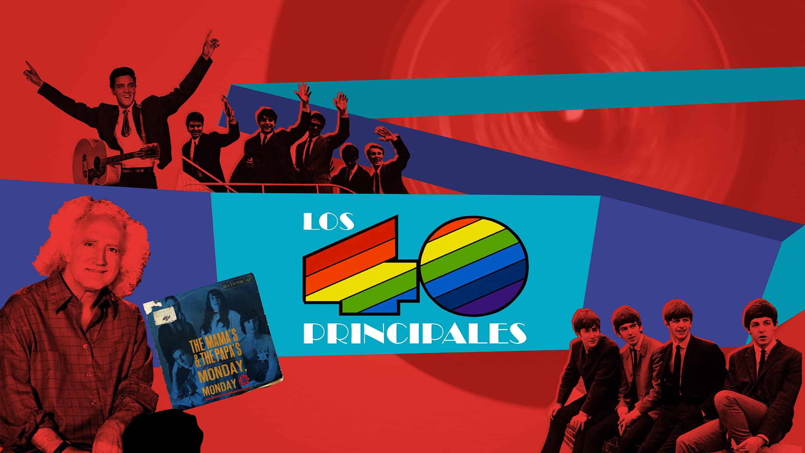
This radio was born in 1966 at the Cadena SER station in Madrid. And it is that at first it was a section of the program that was broadcast only in the capital. A program that only lasted two hours ended up broadcasting up to eight hours every Saturday. Its success among young people finally made it broadcast among more than ten Cadena SER stations throughout the national territory. Pioneers of the radio formula in 1979 began to have its own body, only that it continues to belong as a section of the SER chain.
From that moment, Los 40 Principales then had their full day. And it is that the program at that time already had a duration of 24 hours. It is in 1987 when they become independent and get their own station, called Cadena los 40 principales. It is there when his image spread throughout the national territory, becoming a reference for future stations. His own image with a casual and multicolored tone that refers to inclusion of all audiences and all musical tastes in this case. Thus trying to group the largest target audience that there was.
First logo of the 40 Principales

The first logo that the radio presents is made up of two shapes that evoke a 40. But it's not really functional if it was used today for a digital environment. That is why it is understood that at first it was used for printing posters and for the radio studio, but it was not widely used.
Independence to your own chain

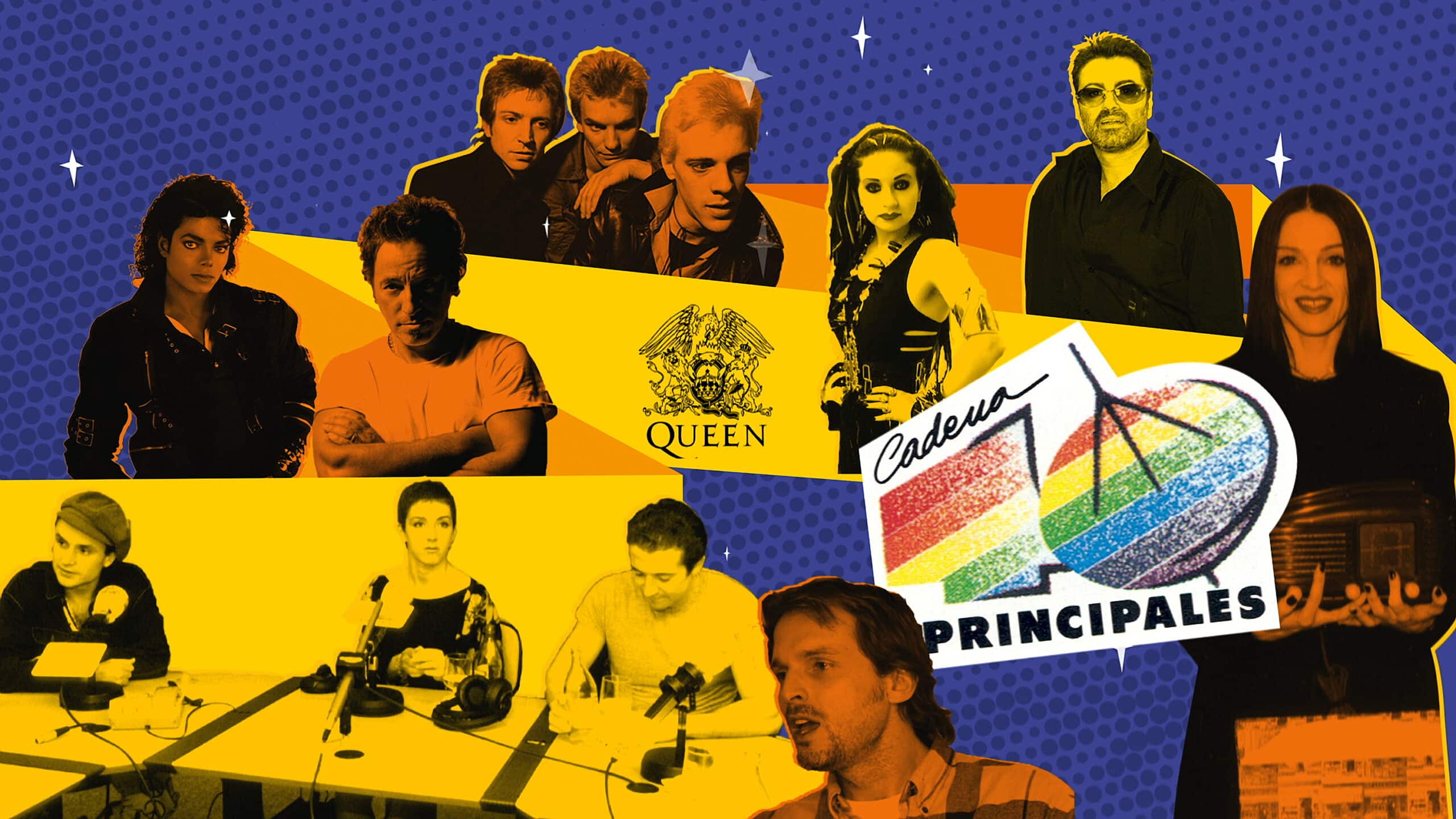
To make a difference between being a radio show that mainly occupied a tiny slot on such an important network nationally as Cadena SER and now having its own chain, they changed the logo. The logo this time was made up of the same shapes, which were linked together by the connection of their colors in the form of horizontal bars that connected one number to another.
Now, they added a wear to that same color and a radio antenna to the number zero. This clearly marked its independence with its own channel and name. They also added the word 'Chain'. This image has clear resolution failures if you want to expose it commercially, for example, to sponsor concerts, records or other types of events.
That is why they changed their brand image twice in less than 10 years. At the beginning, the first change came by introducing holes that marked the numbering of 40. As we have said before, if we wanted a clear identification, especially with the evolution of the Internet and digital media, in a smaller environment it was necessary to introduce differentiation in the number shapes.
Alluding to this change with a more readable part of the logo, they changed to a flat dark red image, but this must not have worked well. The identity that they had won until then was broken by changing to a color that had nothing to do with the previous ones. Not even the hue was similar to any of the five colors used until then. Of course, each number was better identified and there were no such disparate elements that made its legibility complex in small formats.
After these big changes, the chain decides to return to its original colors, making small modifications. for some campaigns such as the chain's 25th anniversary. Where it returns to the first logo as an independent chain surrounded by a seal that says '25 years of music'. After the 25th anniversary, they put a brighter logo with a gel effect that lasts until the last big change in 2016.
The current 40's logo

It was evident that a renowned chain like Los 40 Principales needed a big change. Digital environments, exponential growth of the chain, with international coverage and official radio awards where the best artists from the Spanish-speaking world participate. An image that has been around for more than 40 years and with clear difficulties to be reproduced in small formats, such as social media profiles. In addition to a low digital quality, since the logo was planned for reproduction only on posters or different materials such as methacrylate for the studios themselves.
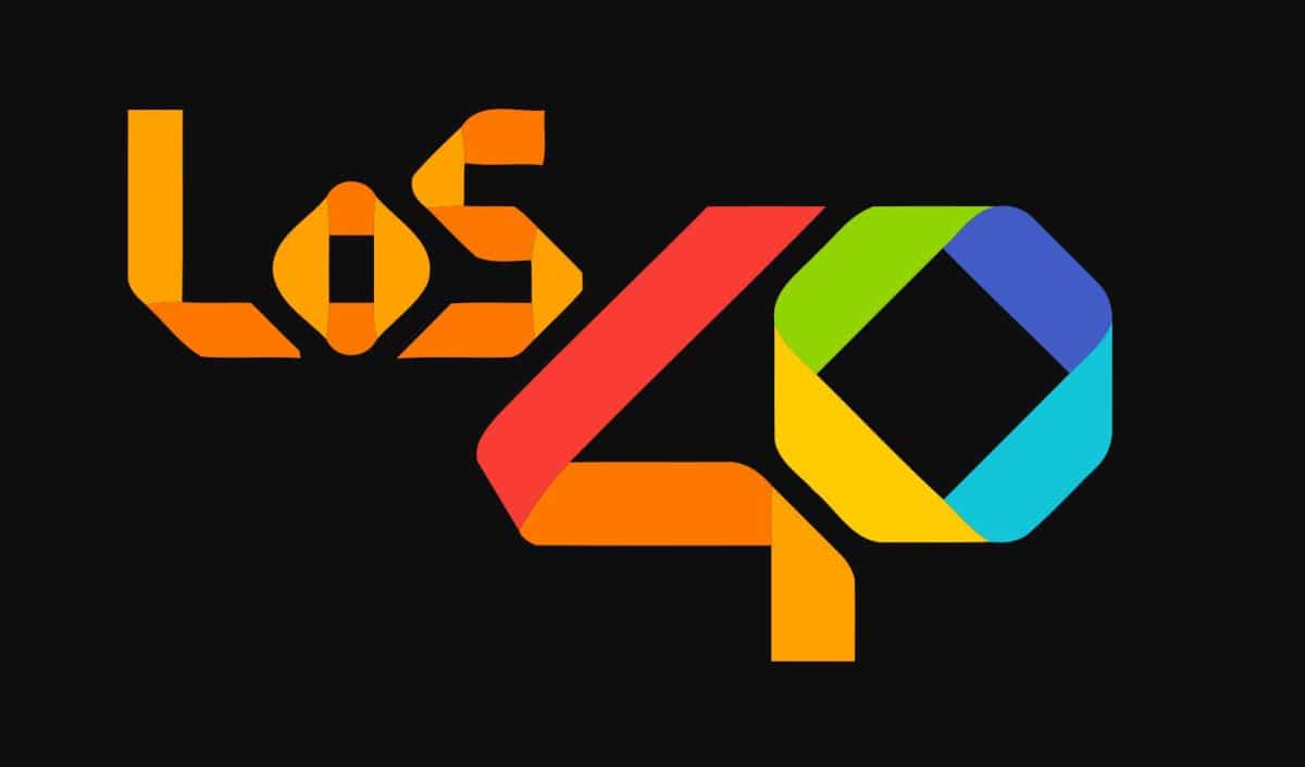
The new brand communicates a renewed vision towards digital entertainment and includes a main change in its name, which becomes LOS40. The word 'main' disappears because it is no longer a list, now its meaning and contents are much broader
This change has been made by the agency Gold Mercury International. It has not only been his image that has been modified, but also his name. The last name of 'principales' has been removed and is now called LOT40. Also his slogan becomes 'Music inspires life'. Something that does not make much sense, since it is aimed at a Spanish-speaking community and should have been done in this language. The logo starts to form loops that make the name, using different colors depending on whether it is the front or back of each of the letters. and numbers that compose it.