
UPS in Venice
Courier and parcel companies have always had many changes and risks. Since its inception they have been adapting to changes, more if possible, in these times. When the entire digital era arrived, where letters were stopped being sent, it seemed that these services were going to end. Nothing could be further from the truth, There are more and more online purchases and companies adapt to it. The UPS logo reflects that change from its inception back in 1907.
And it is that the company was born between two friends, without any type of corporate image nor promotional slogan of the brand. This company merged with another from the town of Seattle in Washignton. Which is when they went from being American Messenger Company to being Merchants Parcel Delivery for their exclusive dedication to delivering food packages.
That's when they bought their first car, a ford model t converted for messaging. And joined by Charles Soderstrom, who suggests painting the vans brown (to make the dust less visible), where the UPS logo begins to appear, in 1916.
First UPS logo
![]()
The history of parcels begins associated with something as traditional as the delivery of messages by birds.. In the case of UPS, we can see its logo represented by an Imperial Eagle with a medium-sized package grasped by its claws. In the package that is represented, the slogan "Sure. Fast. Sure". Emphasizing the security that your company gives in the delivery of the package. Something logical at that time if you wanted to gain confidence with new clients.
The logo has the brown color to match the vans under a black of the central Eagle and a white package. This logo was chosen before the merger with a rival company and lasted from 1916 until 1937, where it changed the UPS logo completely.
The UPS logo, in full
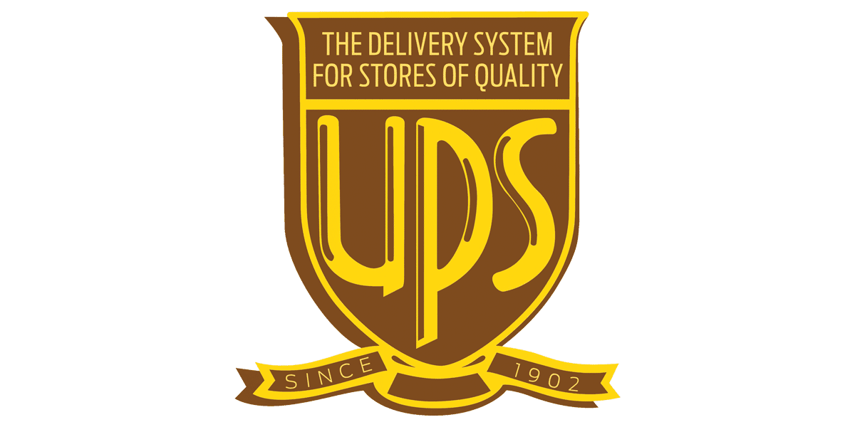
United Parcel Service (Parcel service unit, literally translated) appears for the first time reflected in the logo in 1937, assuming its first major modification. It is not only the inclusion of the acronym UPS that stands out, but also add a gold color throughout the font. Adding some brown lines, simulating thickness and shine.
The shield had a slight modification, leaving the top flat and removing the surrounding white line. They added a brown shadow and a tagline change that reads "The Delivery System for Quality Stores." A clear allusion to a company that was beginning to consolidate in the market and that was seeking the solvency of large companies. In addition, the date of creation of the company appears "Since 1902". Something that is seen in the logo but we do not understand why, since it was started in 1907.
A radical new change
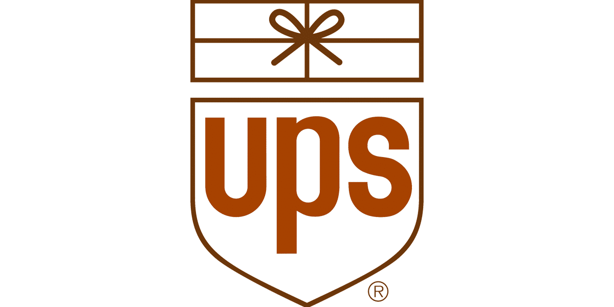
Nearly 25 years later, UPS once again changed its logo to something simpler.. Only reflected by dark brown lines and a lighter Bold UPS lettering. In addition, they added the trademark symbol for the first time.
This symbol is divided into two parts, on one and giving continuity to the previous one, a shield where it encloses the letters UPS. And on the other hand, at the top of the logo, a gift box with a bow. This was not liked in all sectors of the company, since it linked a lot to a specific type of parcel to the company. In addition, mixing a traditional shield with a 'cute' package did not seem the most convenient. Paul Rand, the author of this design, justified it at the time as follows:
The bowtie element was the only way a rectangular shape could be made to represent a package, and that was a simple and immediately recognizable graphic clue to what the company did.
Rand also goes further, justifying its logo to through questions he asked anyone, not just design experts. And it is that he asked her daughter, which she replied: "It's a gift dad." For him this was more than enough, because he expressed what he wanted to achieve. In addition to making a funny logo, something he wanted to achieve because it seemed like a goal to follow.
Up to date with the logo
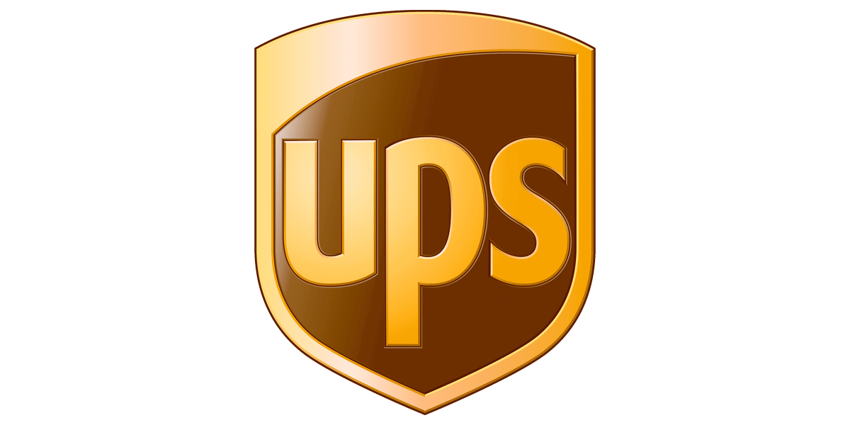
After such a radical change, UPS returned to the path established many years before with its logo. Now in a renewed and modernized way, in 2003 he once again placed the color gold as the primary element. Golden letters, shading and more realistic, due to the possibilities of design in these years a slightly curved shape. In addition, being able to simulate the structure that previously made up the gift of Paul Rand, they put a tab that covered part of the inside of the logo.
The gold of this symbol has a very vintage gradient, which simulated 3D and made it impressive in its prints and labels. This logo lasted until 2014, but its remodeling is not so abrupt anymore, rather a continuation of what this logo is.
digitally adapted
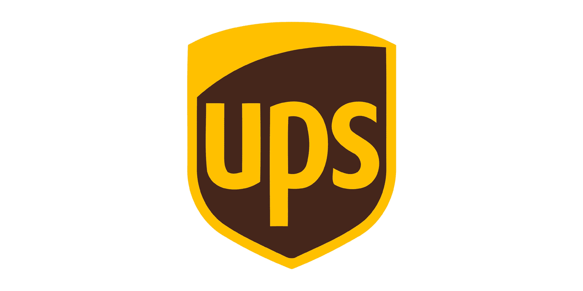
The current UPS logo was created in 2014. The change, as can be seen, does not go beyond subtracting volume, eliminating shadows and gradients to the golden color. This is done for the simple reason that we have been commenting on many other articles in Creativos, where we talk about the redesign of other companies. And it is that to adapt it to a digital environment and social networks, more and more companies adapt their image to a flat line.
Choosing nothing more than two flat and simple colors. Also, as we can see, the kerning between characters and the edges of the shield have been modified, giving more air on each side. This is done to get better readability when transforming to smaller dimensions to fit them, for example, to a web favicon or the profile image of a social network.
This is something that was not taken into account before., since the image was going to be represented, normally, on a large scale. But the design has had to adapt to these new spaces to continue making sense.