
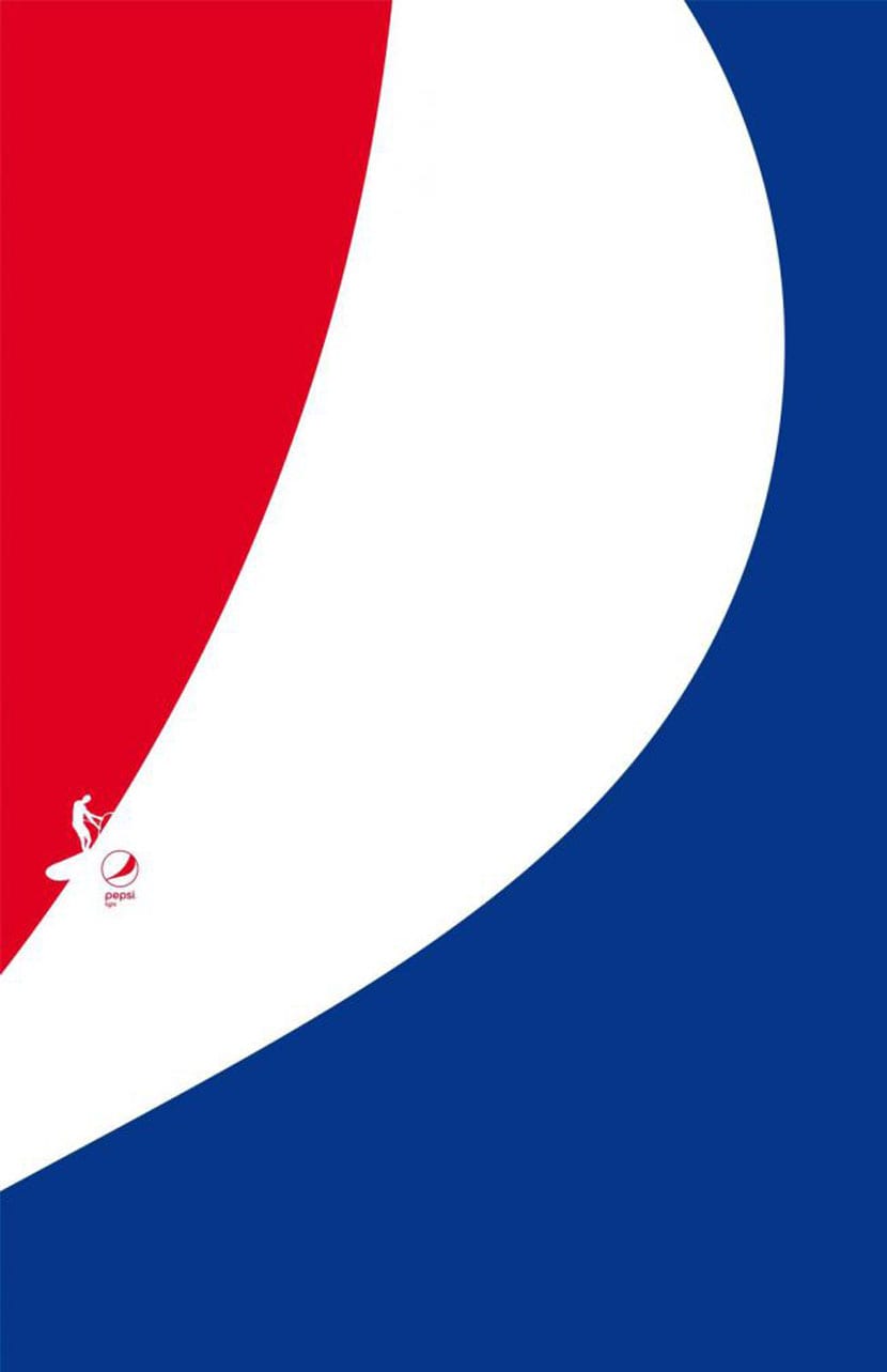
The Pepsi logo, like the one for Evernote just updated yesterday, remains well anchored in its heritage with those three predominant colors. In a new sports-related ad, Pepsi make great use of negative space.
And we are not talking about one drink that is indicated for sports, especially due to its excessive sugar content, so we were rather with its great touch for the design of a series of posters that take the three colors of Pepsi as the predominant note.
The rest of the notes are the figures of different athletes in their own disciplines to show a diver entering the confines of the ocean with a very elegant way of representing it, or that blue that forms the basis for a sailor.
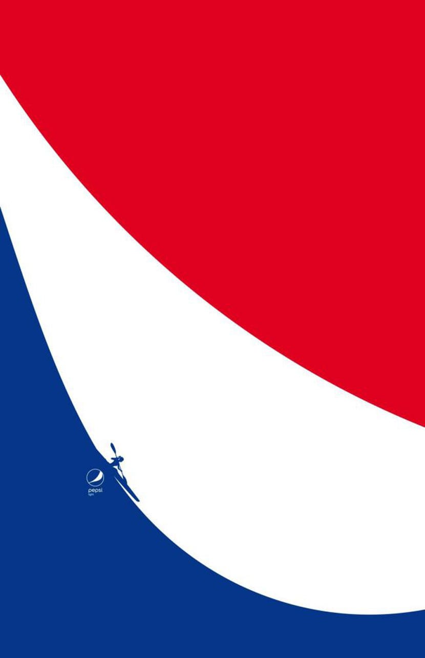
Various options to represent your own Pepsi brand in which their own logo is not missing so no one will forget your refreshing, yet caloric, drink. We have a skier demonstrating his skills on the blue, just like a surfer taking a wave (if we are right).

Another of the cool designs is to use white for the shape of the parachute and the skydiver in the same color to show a risky sport. A series of ads of great elegance and creativity in which Pepsi has surely spent a good amount of money.
As we have been saying, creativity is paid, since it is capable of opening new horizons and showing other perspectives of brands to which we are usually very accustomed and to which it is difficult for us to be surprised. Here Pepsi has done it well, the same thing happened with the new Fanta logo, although without forgetting any of its origins in design.