Any company that dedicates its services to the Internet, moves in a constant change. These changes, both internally and at the design level, have to do with what the public demands. The change of the Zoom logo, like that of other companies, can be due to multiple factors. Whether these are due to aesthetic modification, since it has become old or due to an image deficit when explaining how the company works.
More necessary or less, the important thing is to determine the success of each one of them, as these will be judged by customers. If the design is wrong, the corporate image can collapse and therefore your customers can stop using your services.. Although it seems too exaggerated, due to the change in logo, there are companies that are no longer seen as expected of them.
For this reason we have been able to see, in other logo redesigns in Creatives, as they have not lasted long and have had to re-modify. This is so, because the trajectory and importance of the company has been vanished, by attributing sensations that are not typical of the company. The image is important and that is why we are going to see how the zoom logo has changed since its creation.
What is Zoom and what does it do?
La Zoom company is a company that was born in 2011, by Eric Yuan. This person was an important asset within the Cisco Webex company, which decided to start his own company. Something he would turn into Zoom. The company, unknown to many had about 10 million users until recently. Something that is not bad at all, but that did not have much less a global impact.
As a result of the pandemic, its use skyrocketed. Since this was not a tool used more for corporate issues, but due to the restrictions, we all use it to communicate. It went from those 10 million to more than 300 in 2020 and that's when the company took off to become one of the most important companies today. In fact, we can see that large competitors have emerged as a result of this massive use, specializing more and more in this type of tools.
We are talking about Google Meet, Microsoft Teams, etc. These tools that were on one side, set aside because the presence kept us off the screen in our meetings, has become a need to be linked to them. But Zoom is not just a video calling tool, it is a multi-service company, and that is why it has decided to change its logo.
The first logo, at the level of a small business

The first logo and including the first interface was clearly a project that still needed to establish itself in the market.. Like any new company, you have to start and later, go filing details. This time it is not something different. If you're considering a new Google project, it's normal to see a difference. It is one thing to have a service that comes out of a consolidated project and another to start from scratch.
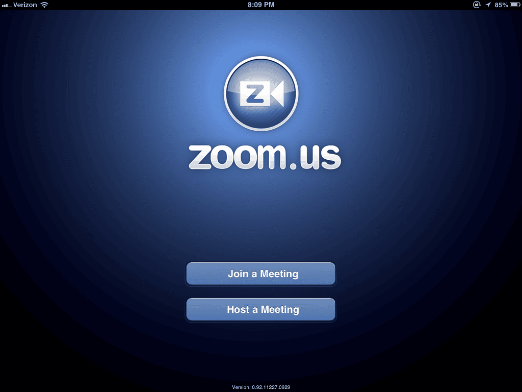
That is why we can see clear deficiencies in this first logo. A grain that marks the image too much. A shade that is rather a rather abrupt division of color and all of this in a closed circle with a white border perhaps too prominent. In addition, the logo has a "Z" as the main image that says nothing and that it gives more importance to it than to other letters of the word "zoom".
This "Z" is marked inside a camera, which looks more like a movie production company than a laptop camera. At the time she was born it was logical that she was the protagonist. Since the service was focused on an application or web tool for video calls with no other service to provide. Its use was quite simple, as you can see in the image, where you could enter a room or create it and that's it.
ZOOM and the rebrand of success.
Later, the company and after only two years, made a change in the logo. In order for your brand to be known and more at the beginning, the logical thing to do is to apply the image change and write your name on the logo. Anyone who wanted to know Zoom could not have a first image and connect it to a “Z” without further ado. That is why this second was clearer and more accurate than the first.. Without deviating from the logo of the video camera.
Of course, establishing more modern lines and adapting them to the chosen typography. Both the typography and the camera had been rounded except for one side. Always leaving one of the sides in a more pointed format. The color was also changed, with a blue with a lighter shade and shading was removed by a smooth gradient to lighter shades. This modernized the format and made it more visible.
In addition, it was an impulse with the moment of the pandemic, in 2020. Since it was a very identifiable image with the use that all users would later give it. His 40 minute sessions were not a problem for those who wanted to have conversations with friends. But for those, such as companies, that were, they could pay a subscription and many do now with teleworking.
The logo now, ZOOOOOOOOM.

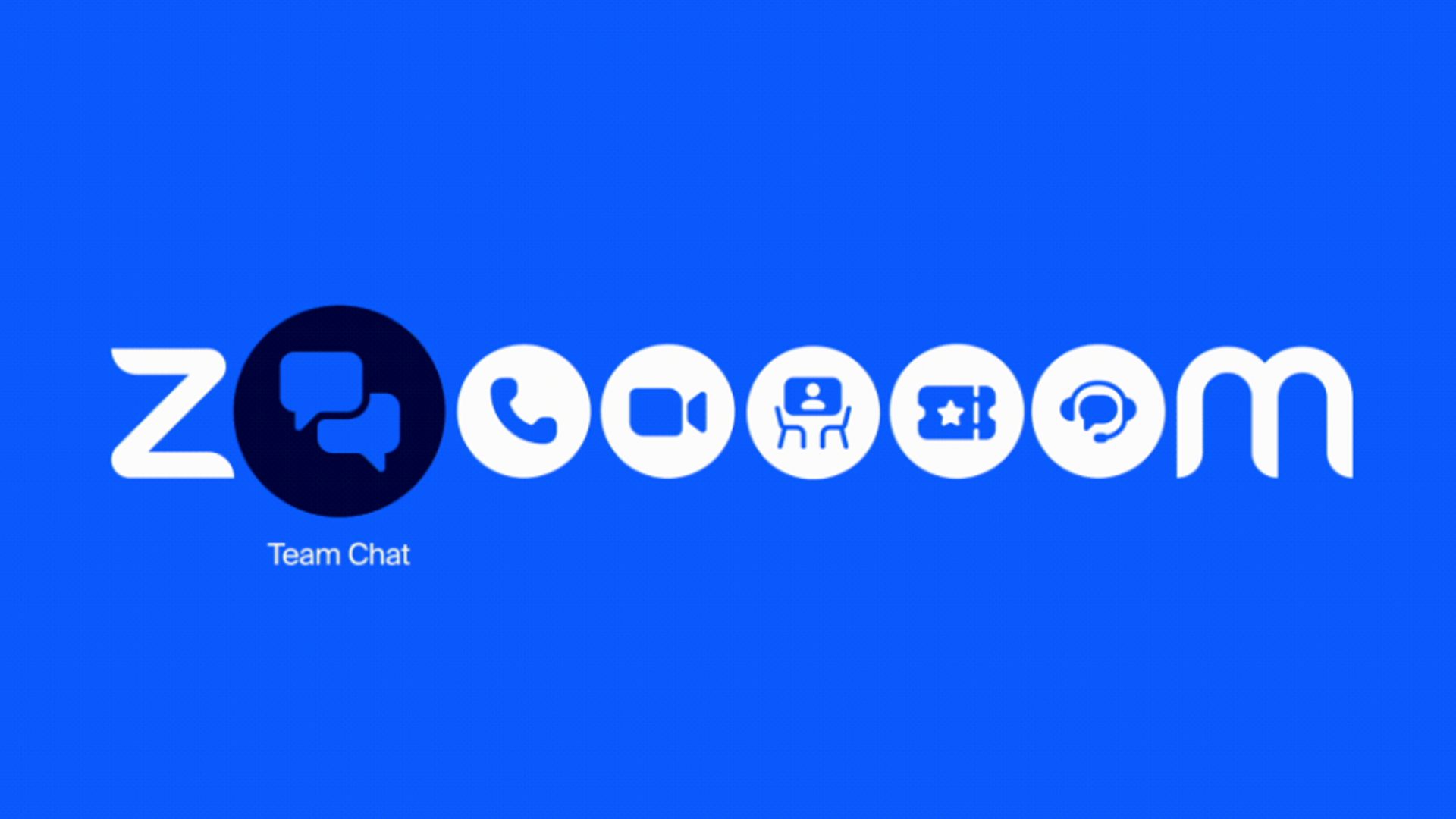
Something very curious is that many people have attributed to the company a unique service. How at first it was, video calls for companies or friends who were far away. But with their exponential growth, they have expanded their services. Specializing in many of them, which are linked, after all, to communication. They wanted to make this clear in their new logo, which has returned to an intermediate color between the two previous ones.
And it is that, although their logo is "zoom", they have wanted to emphasize all the services they offer, filling the “O” with all of them. As we can see in the image, now the company offers services of VoIP Systems, Chat, Online Whiteboard and others, as we can see in the image.
