We know Pantone well as that institute dedicated to color and that each year brings us what will be the colors that will be the source of inspiration for a wide range of various disciplines related to art. We talk about fashion, photography, design and many more ...
United Way, for its new campaign, has partnered with Pantone Color Institute to develop a single Pantone color that puts the accent on making visible poverty, destitution, domestic violence, mental health and social isolation. Problems closely linked to the capitalist world in which we live.
For this they have created a color that have called as "Unignorable", like that tone that cannot be ignored. It's Laurie Pressman, the vice president of the Pantone Color Institute, who claims that this color quickly captures anyone's attention with such a colorful glow that radiates heat and energy.

And if we talk that the United Way logo was created in its day by Saul Bass, a highly reputed and renowned designer, we understand that there is much behind what can be seen at first. The idea behind the United Way campaign is attract people's attention with unique flat color, which is combined with a narrative that is "hidden" and that highlights the daily problems.
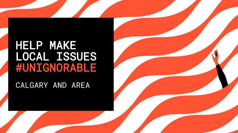
It is also Malika Favre who has joined this campaign with a series of illustrations that capture those intentions of making visible problems of any person that we may meet on the street and that we can never ignore. As you can see, some of them are tremendously communicative and convey those problems.
All accented with that 'Unignorable' tone. United Way is working with Canadian brand Peace Collective to create a series of 'Unignorable' items for anyone to purchase to support the campaign.