You can have very good ideas, be the most creative and propose the best projects that, without the necessary knowledge on printing, they will fall on deaf ears and will be of no use. A mediocre idea well captured is worth more than many ideas in digital files. Because what will matter In the end, it is how good the canvas has been, which can be seen correctly both from ten meters away and from fifty; or the touch of the book, very comfortable when turning the pages and very pleasant to read ...
In this post I bring you some key knowledge about printing that you should be very clear as a graphic designer, especially if you want to specialize in the editorial design. I hope that, if you did not know them, they will be of great use to you.
To avoid surprises with printing
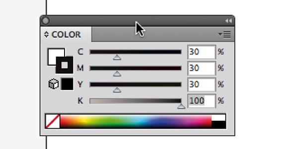
BLACK BED
Also known as rich black. It's about getting a color much more intense black in print. To do this, simply add a pinch of each color. For example: 30C 30M 30Y 100K. CAUTION: You should not raise the values of cyan, magenta and yellow too much, or instead of black you will get a rather ugly brown.
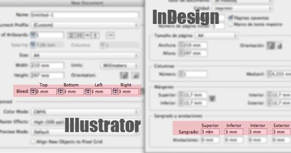
DOCUMENTS WITH BLOOD
We are not talking about you using the color red, nor that you “hurt” your documents. It is about that you must add as minimum 3 mm of blood on all sides of any document that is created for later printing. In design programs such as Adobe Illustrator or Adobe InDesign, the bleed area will be outlined by a red stroke. This security measure will prevent that, if we decide to put a background color or an image, it is printed to the very edge of the page; and that a horrible white steak does not appear.
NOTE: both in packaging and in any element that we want to be stamped, it's good to increase bleeding to 5mm.
SAFETY MARGIN
Do you want all the text to come out when you print? So then do not put anything less than 5mm from the edge of the page. Otherwise, you run the risk of being left out when the printer proceeds to cut the paper. This affects, above all, page numbers: we tend to move them as close to the edge as possible, and we have to take into account the margin of safety in order to avoid problems later.
COLORS
Never use RGB: use either CMYK or PANTONE colors. Printers generally work with four fundamental inks (cyan, magenta, yellow, and black). From these four inks, any other color can be obtained except white and special inks (metallized, phosphorescent ...). The more inks a document has, the more expensive it is.
If you are only going to use a single color in your document, it is best to do it with a PANTONE: it will be cheaper to buy it than to use CMYK.
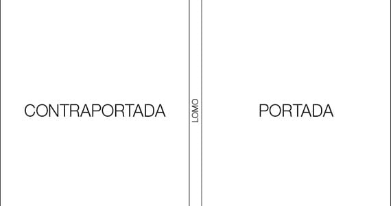
DESIGN COVER AND BACK COVER
If you don't know yet, both are designed in the same document, separated by the spine of the publication. In this way you will have to have your file "divided" into three columns: the left, corresponding to the back cover; the central one, corresponding to the spine and the right, which corresponds to the cover.
AND THE LOMO?
How do we calculate measure of our back? To do this, we must think, a priori, about the layout. Hard cover or soft cover? Then, we will have to know the exact number of pages of our document and the paper that we will use. Then, we take as many sheets of that paper as there are pages in our book, we place them on top of each other and we measure that spine. This measurement will correspond to the spine of our book if we are going to layout it in a soft cover.
What if we want it with a hard cover? Simple. We add 4mm of the thickness of the cardboard (two for the front cover and another two for the back cover).
TYPOGRAPHY
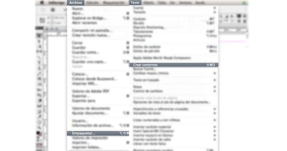
If you want to make sure that the typeface you have chosen very carefully will be printed, you have two options:
Rasterize all text (in InDesign, select it and go to Text> Create Outlines).
Package the document and print a folder with fonts, images, etc. (in InDesign, File> Package).
THE RESOLUTION
The images, whenever you are going to incorporate them into a physical and non-digital book or magazine, try to have the highest possible quality: 300 dpi and in CMYK color mode. If you are dealing with a book whose protagonist is photography (such as art catalogs), check with the printer: color reproduction is especially important here, to be as exact as possible.
PUNCHING
To indicate a die, in addition to communicating it verbally or in writing to the printer, you must enter it in the file itself. In Illustrator, the usual thing is to create a new layer (which you can call DIE) and draw the line with a Pantone color (which we can also rename as a die) that will have to be overprinted.
Thank you very much for the explanation and advice. All the aspects dealt with in the article are very important to make a file, starting from the format, the colors, the indentation, the safety margin, the resolution, etc. It is a very interesting writing since in this way you can know the appropriate characteristics that a file should have before printing it. Fulfilling these parameters the final result will surely be optimal logically if it is done with a professional printing company.


Very interesting information.
I'm glad you liked it.
Happy Holidays
It suits me great;)
Thanks! really very good :)
Thank you very much for the explanation and advice. All the aspects dealt with in the article are very important to make a file, starting from the format, the colors, the indentation, the safety margin, the resolution, etc. It is a very interesting writing since in this way you can know the appropriate characteristics that a file should have before printing it. Fulfilling these parameters the final result will surely be optimal logically if it is done with a professional printing company.
Global identity work has saved me. Many thanks!!!