Source: Wikipedia
Knowing the history of fonts can be interesting for you, if you know that some are sometimes created to compete with each other. Although others are created for a specific function. This is the case of the Arial typeface, initially it was created to lower costs but ended up competing with another very famous typeface: Helvetica.
You don't have to have great eyesight to realize the similarity they have with each other, yes, there are differences between the two families and some characters are quite different. Below I will tell you a little about the history of the Arial font, its characteristics and the rivalry that these famous fonts have today.
History of the Arial typeface
To know when the Arial typeface was designed, you have to go back to 1982, when Robin Nicholas and Patricia Saunders, two Monotype Imaging workers, decided to work on the typeface, which had the function of adapting to printing, specifically for printing. IBM laser printer. It was not until 1992, when Microsoft made the decision to change its name, as a result of the launch of Windows 3.1.
It was designed with the idea of creating a typeface similar to Helvetica, in terms of measurements and proportions., so that a document designed in Helvetica could be displayed and printed correctly without having to pay Helvetica royalties. It is considered a very legible typeface, but at the same time of low quality. In 2007 it was replaced in the Office package, for the Calibri typeface as the default font in programs like PowerPoint, Excel, and Word.
Characteristics of the Arial font

Source: Wikipedia
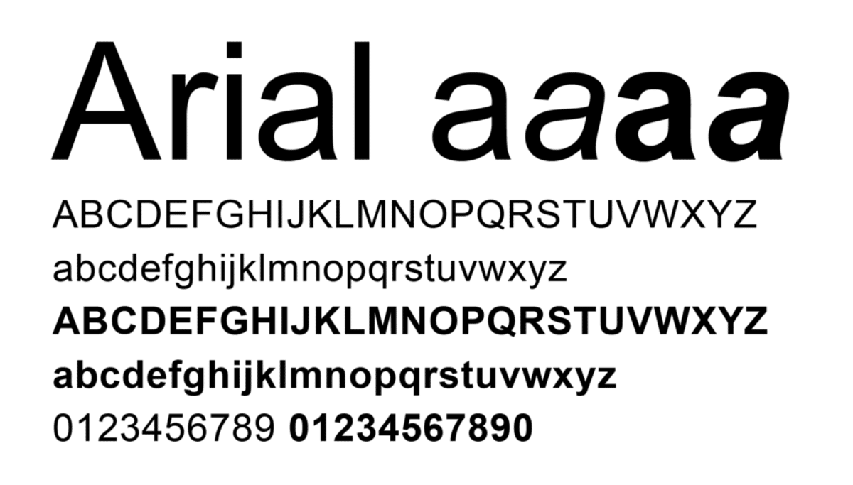
Arial sometimes known as Arial MT, is a contemporary sans serif typeface, with a functional, simple and standard style. It is capable of adapting to the body of continuous text. It has humanistic characteristics. It is one of the most used fonts in programs like Word and in practically all versions of Windows. Regarding the characteristics of this typeface, we can say that It has good legibility in different sizes, and can be applied both in printed media (advertising, texts, posters, newspapers...) and in online media..
It has a more rounded design than Helvetica, with smoother curves. The strokes are cut diagonally, which makes for a less mechanical appearance. The style of the glyphs of Arabic origin comes from the Times New Roman typeface. It also has hinting, which are specifications that it contains so that it can be printed correctly on low resolution devices such as a monitor.
Variants of Arial
The Arial font contains many styles: Regular, Italic, Medium, Medium Italic, Bold, Bold Italic, Black, Black Italic, Extra Bold, Extra Bold Italic, Light, Light Italic, Narrow, Narrow Italic, Narrow Bold, Narrow Bold Italic, Condensed, Light Condensed, Bold Condensed and extra bold condensed.
- Arial: Known as Arial Regular, it is distinguished from Arial Narrow by its width.
- Arial black: There is also Arial Black Italic. This is quite a heavy style. It only supports Latin, Greek, and Cyrillic.
- Arial Narrow: Arial Narrow Regular, Arial Narrow Bold, Arial Narrow Italic, Arial Narrow Bold Italic. It is a condensed family.
- Arial rounded: Arial Rounded Light, Arial Rounded Regular, Arial Rounded Medium, Arial Rounded Bold, Arial Rounded Extra Bold.
- Arial Light, Arial Medium, Arial Extra Bold, Arial Light Condensed, Arial Condensed, Arial Medium Condensed, Arial Bold Condensed.
- Monospaced: regular, oblique, bold, oblique bold.
Helvetica VS Arial: Rivalry

Source: Wikipedia
These two typefaces are only one year apart in terms of their creation, and different reasons for which they have been designed. Ever since the Arial typeface was created, it has constantly been attacked for being a "copy" of the Helvetica typeface. The latter was designed in order to compete against the Akzidenz Grotesk typeface.
It is said that the main reason why Microsoft decided to choose the Arial font for its programs was because they could not afford the Helvetica font. It is also said that Arial was also created to compete with the Helvetica typeface, rather than to be a copy. Despite the comparison today Arial is much more widely used than Helvetica, not because of its popularity but because of its availability. Monotype director Allan Halley, years later, has declared more than once that the idea that everyone has that they could not afford to pay for the Helvetica license is totally wrong, because as he says, only the development of Arial could finance a small country.
If you have been wanting to know more about other fonts such as Helvetica, I leave you the link to two articles, in one of them you will be able to know all the history of this famous typography. And in the second, another article that talks about the Helvetica documentary. I hope this article has been of interest to you.
Very interesting story. Thanks.