
If you are starting in editorial design you must know how to layout correctly the texts that are provided to you. For this it is necessary to be familiar with some concepts and take into account the different configurations that we can make in a layout program such as InDesign. On this occasion we share with you a series of fundamental notions about the base grid such as what it is, what it is used for, what types are there and how it is configured. Pay a lot of attention!
Main questions that arise about the base grid
What is the InDesign base grid and what is it used for?
This is the set of imaginary horizontal lines used for the correct placement of texts on the pages of our documents and thus have an orderly appearance. They also serve as a guide for the designer to support other graphic elements (images, symbols, etc.) on them.
The base grid it is a mere guide for the designer, which in no case will be printed in our documents. It is a visual orientation that helps us to make a better layout.
What types of base grid are in InDesign?
- The document base grid. The configuration of this grid will affect and be applied throughout our document, on all pages equally. This grid exists by default in our files, what happens is that it is hidden by default. We can make it visible and customize it depending on the configuration of our document to our liking. To proceed with its customization we will have to go to Edit> Preferences> Grids> Base grid (on Windows) or InDesign> Preferences> Grids (on Mac).
- The base grid of text boxes. This option allows us apply a different base grid to the text box we want. Thus, we can have all a text aligned according to the document base grid and a box aligned according to other parameters. To do this, just select the box and go to Object> Text frame options> Baseline options (both Windows and Mac).
How do I properly configure my base grid?
The grid represents the line spacing of the text of our document. Therefore, the parameters of our grid will change depending on whether the body of our font is 14 pt (it would have a leading of 16,8 pt) or 12 pt (a 14,4 pt of leading). That last option is the one that we will have, by default, in our file.
We are going to configure the base grid of our document. We open InDesign and with it, a new document. In our case, we leave the values as they are (A4 page size, 12,7 mm margins, 1 single column). We decided on a 12 pt Times and 14,4 pt line spacing. Once this last value is known and taking into account our margins (especially in our upper margin), we proceed to configure our base grid.
Let's go to Edit> Preferences> Grids> Base Grid (on Windows) or InDesign> Preferences> Grids (on Mac). Now we have to look very closely at three fields: Home, Respecto a e Increase every.
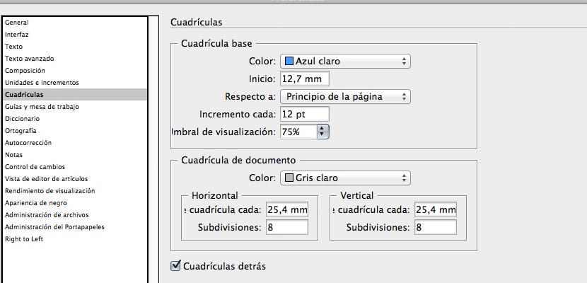
Dialog box in which we will configure the parameters of our base grid
En Home we will have to enter the value corresponding to our upper margin. In our case, as it is the figure that InDesign brings by default, we will leave it at 12,7 mm.
En Respecto a we will choose the option we want. If we check Top of page, the grid will be applied to the entire page (including margins). If we select however Top Margin, the grid will be applied from it. We will leave it in this second option.
In the frame Increase every we will put the value corresponding to our line spacing: 14,4 pt.
After giving the OK to this configuration, you still do not see the base grid? Of course not. You have to go to the menu View> Grids and guides> Show base grid. Clever!
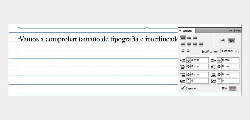
Still don't see the text “guide” through your grid? You lack one last little thing. Select the text boxes in your file and select the option that you will find within the Paragraph palette that says Align with base grid.
We will click on the red icon in the image to indicate to our text box that it must adjust to our base grid
One last suggestion. There are many people who, instead of applying the leading value to the field Increase every enter half of that number. In our example the half of 14,4 pt would be 7,2 pt. The advantage of this technique is that we will have greater flexibility when it comes to layout texts. The disadvantage is that our document can be quite confusing due to the existence of an excess of horizontal lines. Still, I recommend you try.