The distintos isudios sobre la abyienInc bodyatVAT señalan which el uso de varios aesthetic elements (logotipos, withores, typeografías, etc.) helps to frame the message and the brand to be recognized by consumers.muchas veces se deja de led this elemento importante de la imagineen bodyatVAT, foro al final todo isá en la firstwas imprsion, y si el logotipo No. isá cuided, la emptravel puede sufrir una mthat abyienInc doors that ojos of the consumidor.
Easta es la razon by la which the empresas againstScientifican su logotipo with el too of the tiempo, en busca de la mejNow de la imagineen bodyatVAT.El logotipo es uno de that elementos mace importantes de la abyienInc bodyatVAT. But it is also important to know that there are other types of images that help represent the logo. Here we are going to tell you a little about what isotypes are and we will give you some examples.
What is an isotype?
An isotype is graphic representation of a brand, a type of logo that does not contain letters or words, can be an image, a symbol or an icon. The objective of an isotype is to represent a brand in such a way that the buyer identifies the company just by seeing it.
It is a visual resource, which symbolizes the brand. It is important that the isotype stands out from the competition. It takes a long time for users to connect you to the brand, but once they do, visually it works very powerfully.
As for the etymological meaning of the word isotype, we can say that it comes from the Greek "iso" and "type".
Characteristics of the isotype
The main characteristics of an isotype are the following:
Allows brand identification without adding any type of name or letters
In this dibujo, image or icon that can have different color combinations or just one.
Transmit abrand related message, related to its values and principles.
Es easy to identify and easy to remember. The longer a drawing stays in the mind, the more efficient it becomes.
Helps to strengthen the image brand.
Isotype classification
The isotypes are further divided into six other categories:
Monogram: It is an image that represents the brand, the first letter of each word is combined. They do not need to be legible.
Anagram: This type is made up of several syllables that are linked together. They can also be formed by rearrangements of the letters that compose it. They are mostly used to create brand isotypes that contain very long names. Thus the brand name can be remembered more easily.
Sigla: only uses initials of the brand name, that is, the first letter of each word of the brand. They must be legible and perfectly identifiable.
Home: Only the first letter of the brand name is used to create the symbol. It is the representation of a brand by means of a single letter, the first of its name,
Company: It is similar to a personal signature. It only contains letters. It is always the name, surname, or distinctive of a brand. It not only conveys the brand name, but also gives the logo a personal touch.
Pictogram: it is a figure that accompanies the logo. It can be a drawing or icon in relation to the brand. In both cases, it can be a figure that allows you to recognize something specific or an abstract image that identifies the brand. The former can be a representation equal to the real thing, while the latter have various colors, shapes or striking compositions.
Examples of isotypes
Below we show you a series of isotypes so that you understand and know how to better recognize the concept.
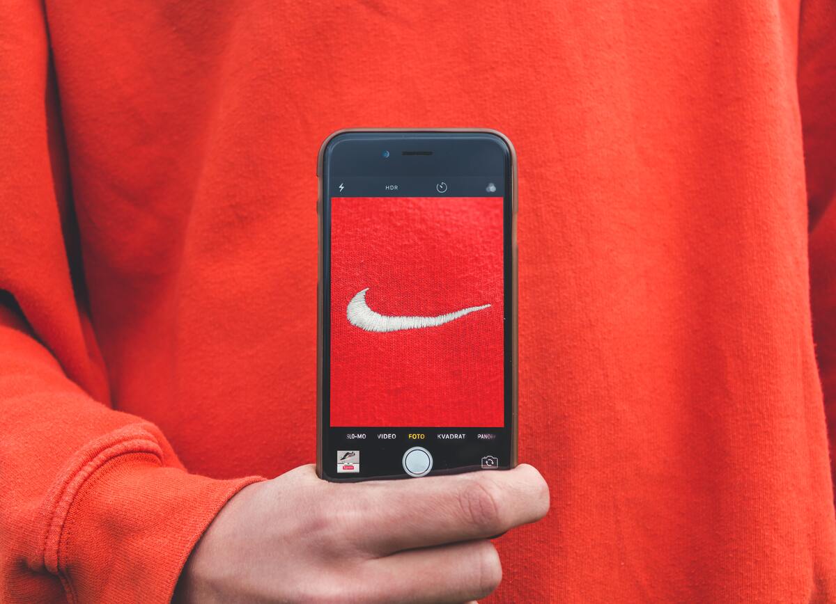
Nike
The isotype that represents Nike is called «swoosh«, was designed in 1971 by graphic designer Carolyn Davidson. To do it, he was inspired by the Greek goddess: Nike. It is the goddess of victory. This is born from the wings of this goddess. The brand wanted its values to be related to movement and victory.
Audi
The isotype of the Audi car brand is formed by four rings embracing each other that refer to the unity of four original companies that gave rise to Auto Union: Audi, Horch, Wanderer and DKW. From this agreement a new firm called Auto Union was born, which would give rise to this isotype of four interlocking rings representing each of the associated brands. Later two other companies joined: VW and NSU, but decided to keep the 4 rings as a symbol.
Playboy
Possibly one of the most famous isotypes in all of history. This isotype was designed by Art Paul, who would later become the magazine's art director. The rabbit has humorous and sexual connotations. It represents the fun, charming and playful character of the brand. As for color, the designer opted for black, as it refers to men's suits, which are elegant and formal and do not need color.