![]()
Designing the logo from a recognized brand has to go through the hands of the most popular studios and famous. And more than one brand of beer such as Guinness, one of the best known in the world.
A beer sold in more than 150 countries with 10 million beers consumed daily around the world. Guinnes will soon introduce a revised logo designed by Design Bridge, a London-based studio.
To bring a new take on the recognizable Guiness logo, Design Bridge used models created by itself and mock-ups of various skecthes made with the guidance of some harp manufacturers, Niebisch & Treee.
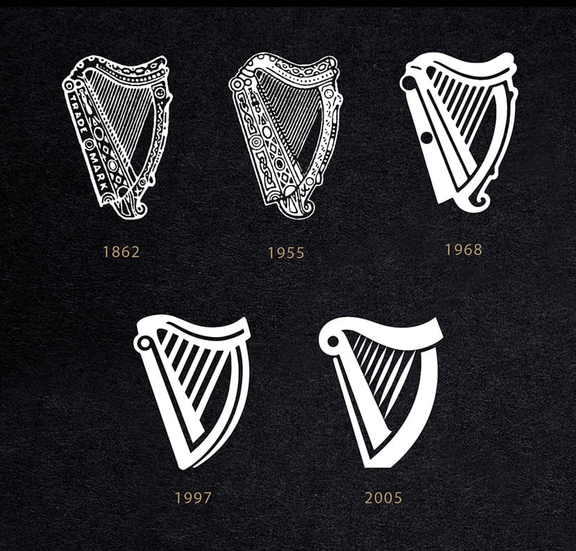
This collaborative process allowed the team immerse themselves in the shapes and lines of the harp, from the characteristic curve of the harmonic neck to the way shadows are projected onto the instrument, ensuring that your design looks and feels as authentic as possible.
![]()
Once Design Bridge finished with his sketches, I took them to Gerry Barney, who has the distinction of being the one designed the logo for the British Rail in 1965. He drew the one-color version of the logo that can be seen below.
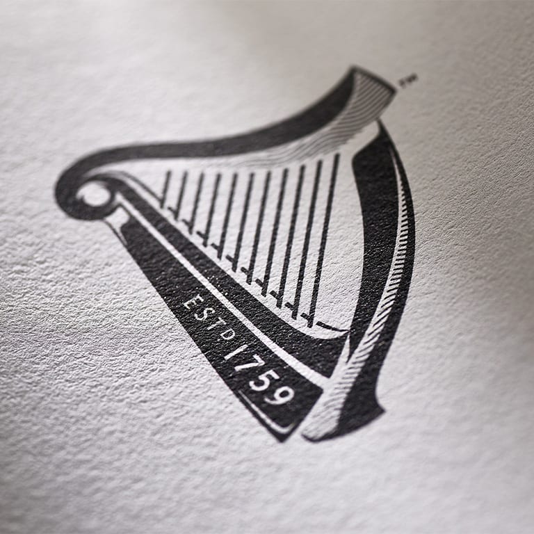
Finally passed to work with New North Press to reproduce the logo in different printing techniques to find the one that best suits you for color reproduction and what would be the eventual digitization of the final harp.
The result is mixed in an unexpected texture that defies typical shading or even the 3D renderings of some logos.
![]()
The final logo is quite striking and surprising. Avoid minimalist trends . in vogue these days. The details are more noticeable with the logo at a larger size.
![]()
Design Bridge declares that the new logo can work perfectly for some of the craft beers in Europe to limited editions in Africa. A simply sublime logo perfect for those who appreciate a good Guinness.